
During a recent #MakeoverMonday challenge, I thought about the idea of using a view of the data in the title somehow, purely as a design element. There are many ways this could be done, and any number of chart types could work, depending on how you want it to look.
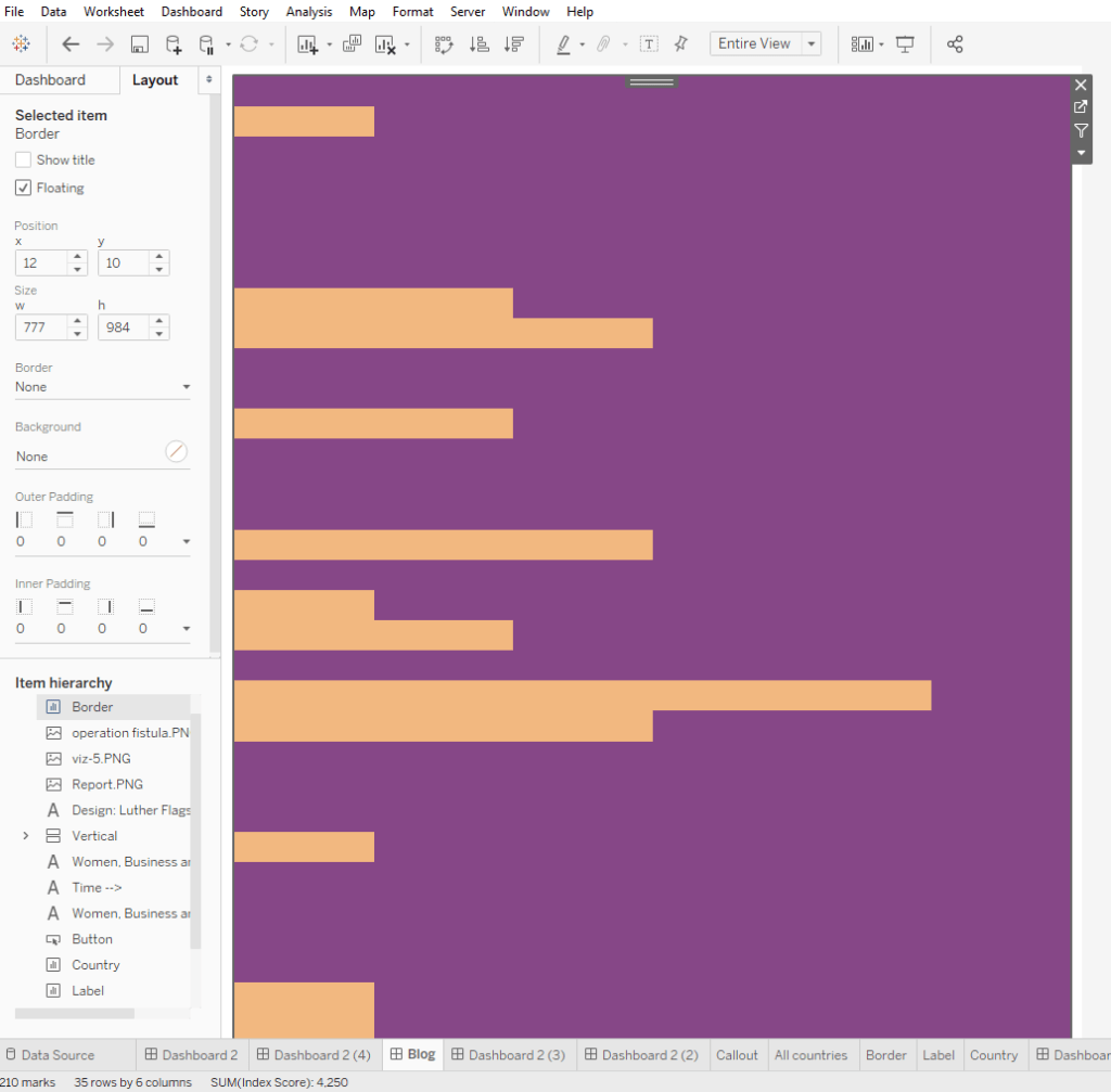
I got the idea because of a highlight table I had made with 250,000+ marks:
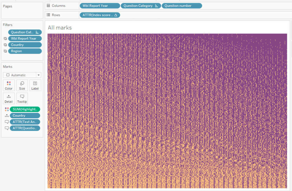
I could put it in a floating container and make it as small as I wanted. Here was idea 1:
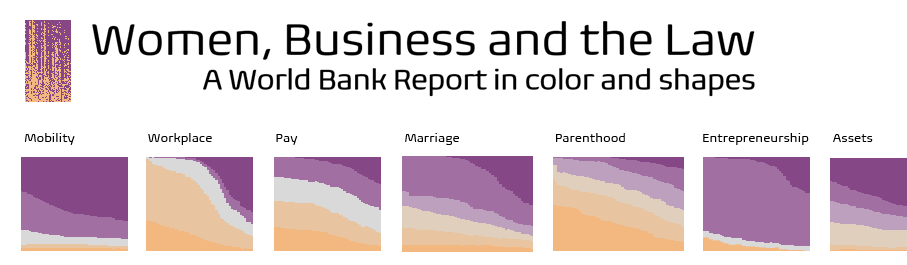
And idea 2:
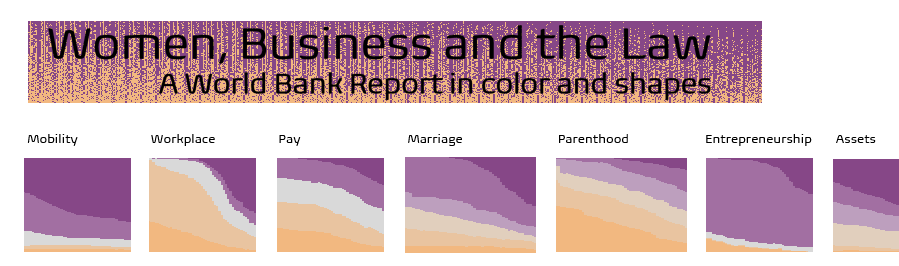
I ended up not using either of these, but in a subsequent revision, I got the idea to use a similar highlight table as a border for the final viz.
There’s really nothing complex about this, but there are two conditions:
- The border needs to be a view that has marks that extend all the way to the four edges.
- The view needs to change with either dashboard actions from user interaction with other views in your viz, or with filter/parameter selections.
Here are the basic steps:
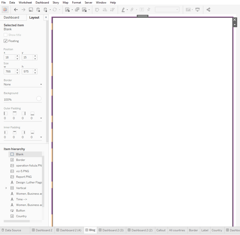
- Make the view and have it cover the entirety of your dashboard.
- Float a blank object over the view, choose a background color (I chose white), and position it for a desired border width.
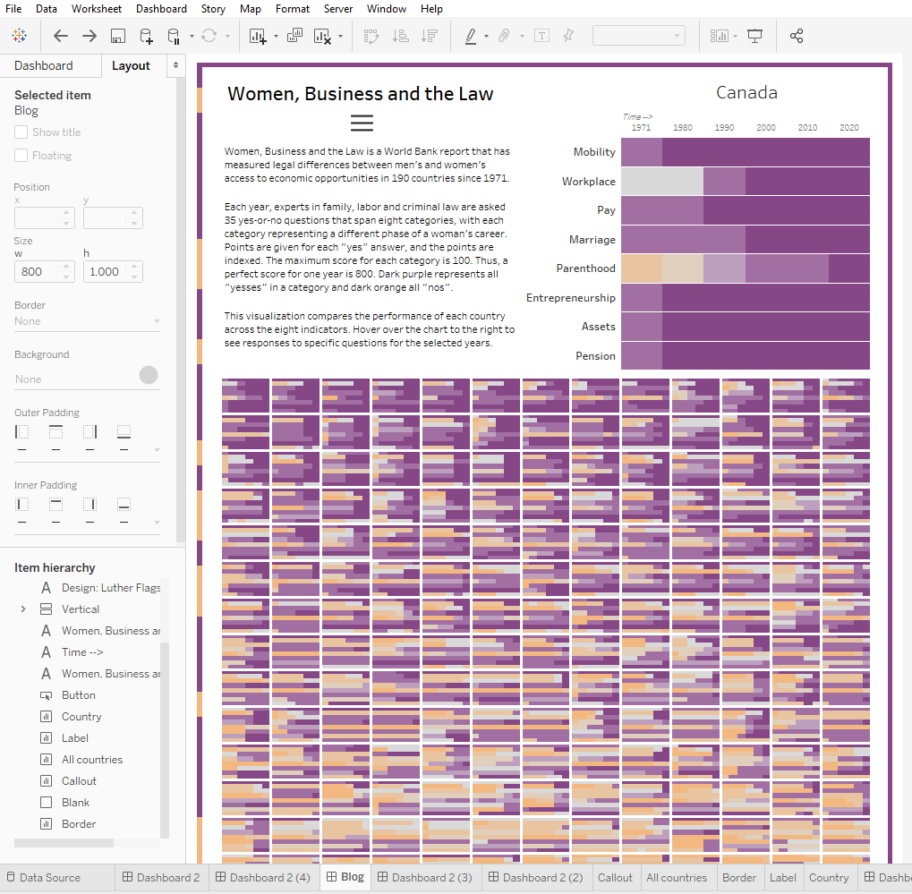
- Create your viz inside of the border, on top of the blank object.
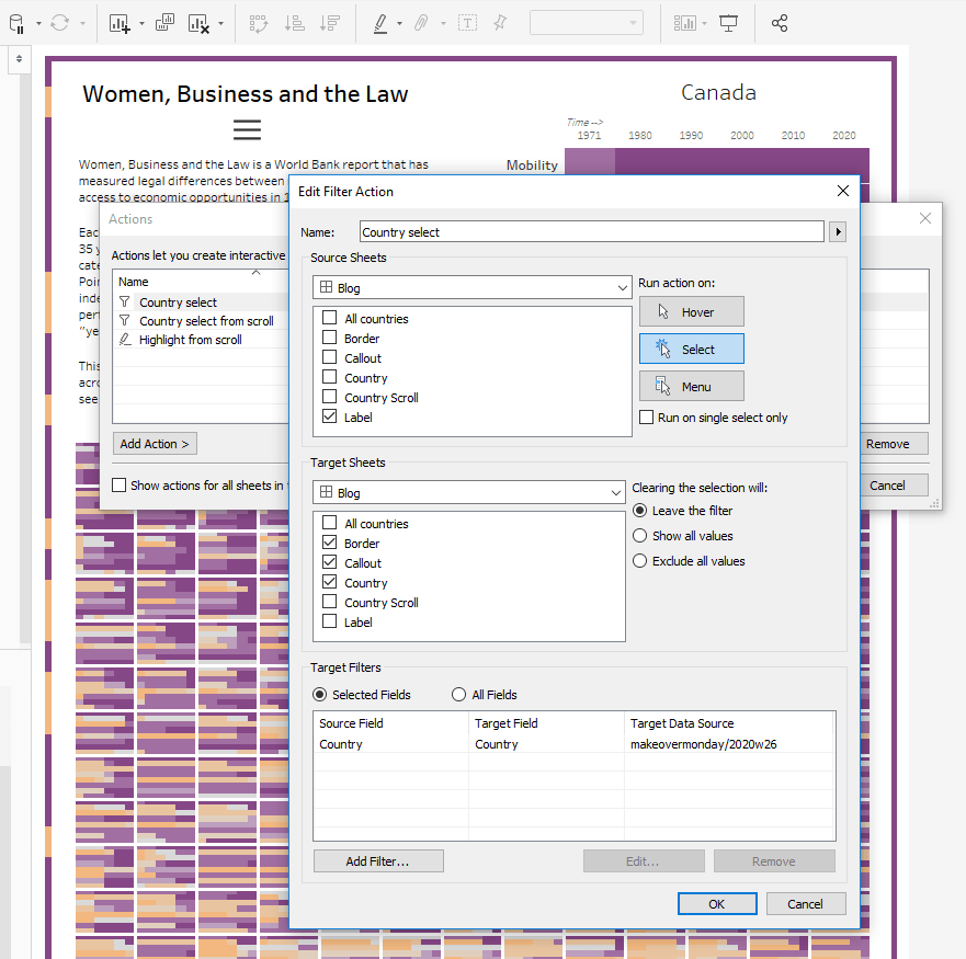
- Set up the dashboard actions or filters to act on the view that makes up the border.
- Decide if it makes sense to leave tooltips turned on for the border view. Turn them off if you don’t want it to be potentially distracting or confusing.
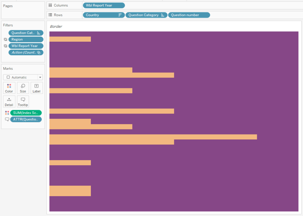
Step 1: The border view
Step 2: The blank object
Step 3: The viz
Step 4: Dashboard actions
In this case, the choice to filter the border view to a country was deliberate, because the main viz centers around the user selecting countries. So, I want the border to update with each new country selected.
Step 5: I turned tooltips off.
View the dashboard on Tableau Public, if you would like to check it out.
You see that the border changes depending on what country you click on. I think it works pretty well in this case, since the colors of the background match the colors of the country’s view, emphasizing the point. But what’s your take?
While writing this post, I thought about modifying this dynamic border idea for views with marks that don’t extend to the four edges. This could be accomplished by, in Step 2, making the blank object slightly transparent so that the view covering the entirety of the dashboard/viz shows through a little bit. (And then making your viz’s views transparent.) You will have to use your discretion, of course, about what kind of a view to use as you don’t want the background to confuse or distract from your main views.
Here’s a bonus (silly) look at another dynamic border, just for some ideas:
This border was made from a jitter view of a somewhat arbitrary selection of categories, just to get a good fill. (Hint: After setting your jitter pill to a dimension, fix the axis from 0.1 to 0.9 so that the bubbles get cut off at the ends, then hide the headers.)
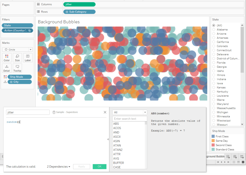
The important condition to remember is that this border view needs to get filtered by some kind of user action in your actual viz. In this case, I used state.
Let me know what you think! What other ideas do you have for dynamic borders?
