The following post is about the process of creating the viz Top 100 Baby Names 1969-2018. Click to view the interactive viz on Tableau Public!
In my first several months of using Tableau, I did so exclusively for work-related projects. Most of it revolved around preparing reports of counts and descriptive statistics, and all entirely for print. (None of the intended audience had Tableau access, including Tableau Reader.) I stuck almost entirely to line charts, bar charts, and highlight tables. (Ok, and straight up tables–it was requested, and I was mostly trying to reproduce what had previously been produced in excel.)
But that’s all for another post. The point here is that it wasn’t until after half a year of using Tableau that I started to become aware of some of the charts available beyond what was in “Show Me.” When I discovered Tableau Public and started clicking around on the vizzes being produced, I was blown away. (Tableau can do THAT?)
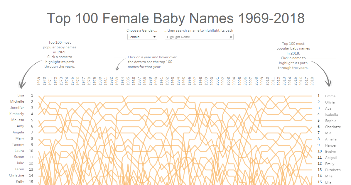
One of those early charts was the bump chart, a chart that can show the changes in rank or position over time or space. It’s been quite some time now so I unfortunately cannot remember the original viz, but I downloaded one and deconstructed it to see how it worked. I immediately started brainstorming a use case so that I could make my own.
Baby names, for some reason, came to mind. I think I had just gotten engaged about that time, so maybe that had an influence.
A quick google search led me to the Social Security Administration’s site, which publishes the top 1000 baby names for both female and male each year going back to 1879. At the time I hadn’t even heard the term “API” let alone write one, so I set to work filtering on 2018, copying and pasting into excel, then 2017, copying and pasting into excel, then 2016…I stopped after 50 years as that was about the limit of my tolerance for copying and pasting for one evening.
(Ok, so I still don’t know how to write an API, but at least I know that’s a thing, right?)
The data set was just four columns: year, female name, male name, and the rank for that year, with 50,000 rows.
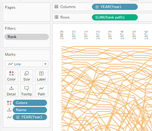
The bump chart I made was also very simple to put together. It’s just discrete year on columns, rank (continuous) on rows, name on detail, and year on path.
At first I had created two different sheets, one for female name and one for male name. I was thinking I would publish a workbook with two different sheets, one for each female and male, but wanted instead for the user to view it all without having to click to a second tab. I don’t remember how/when I first learned about parameters, but this proved to be a good use case for a very simple parameter:
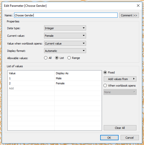
Writing this really helped me solidify my basic understanding of how a parameter allows the user to choose what measure or dimension they want to view in a chart.
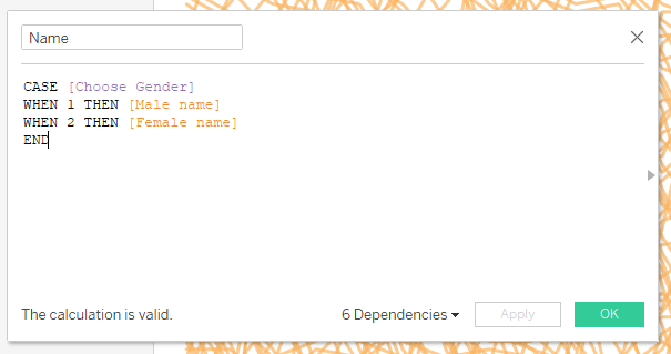
The next issue I had was trying to figure out how to have a unique color for each gender. This I solved by creating a new dimension using the same parameter:
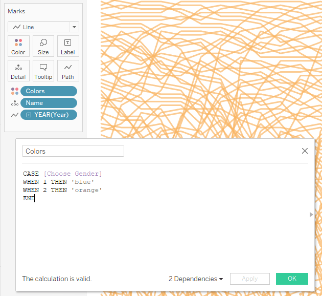
I put this on color, edited the color for one of the parameter selections, changed the selection, and edited the color there too. Solved.
Now that the bump chart was ready, I needed to put the name and rank down each side, one for the top 100 names in 1969 (my starting year) and one for 2018 (the last available year). I wanted symmetry with the numbers closest to the lines, so I created one sheet with name on rows, and one with rank on rows, swapping the dimensions on text.
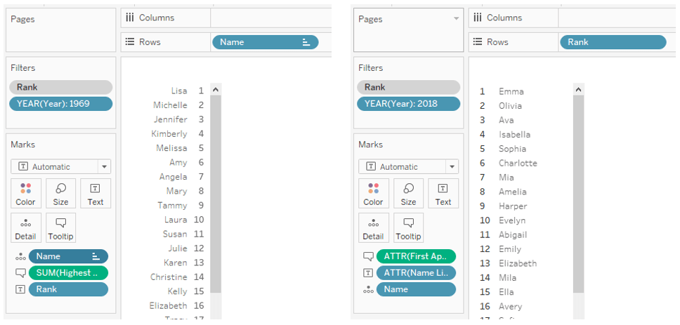
Using floating sheets, I positioned the bump chart and lined up the 1969 list and 2018 list so that the names matched up with the rows. Almost there!
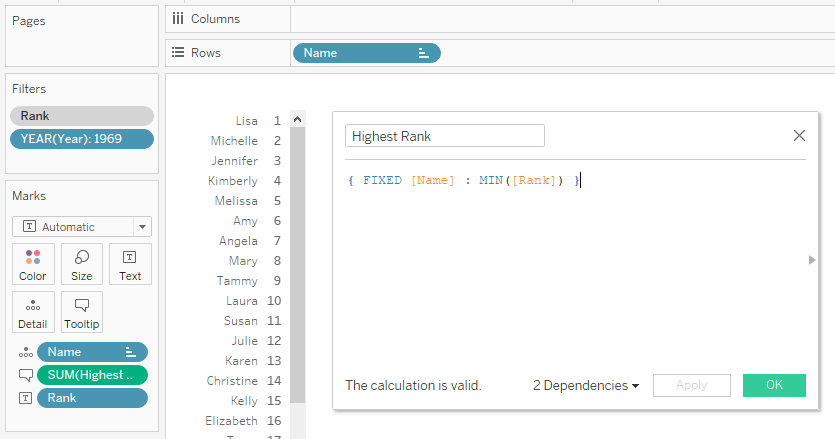
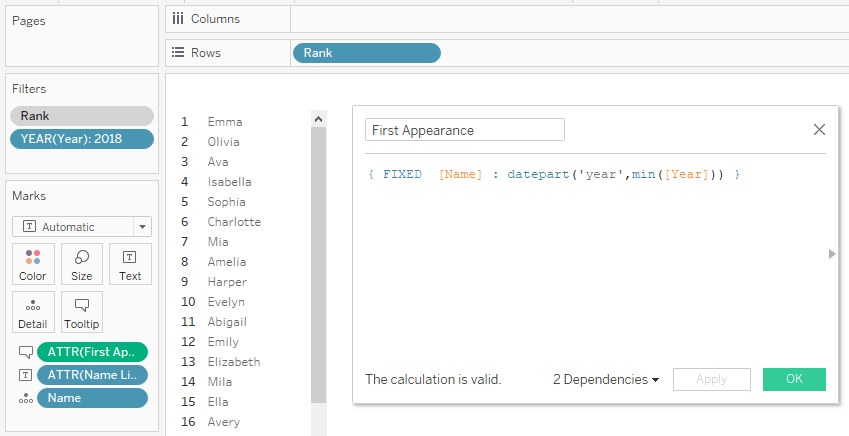
The next thing I tackled was tooltips. For the chart I included name, year, and rank. The 1969 and 2018 lists were a bit more of a decision since for 1969 the marks were the ranks, and for 2018 the marks were the names. I decided on the 1969 list to show the highest rank achieved during the 50 year period, and the 2018 list to show the year that the name first appeared (with 1969 as a starting point). This was just sort of an extra bonus.
I got stumped at first since adding the dimension “rank” simply returned the rank in the mark. (I had filtered to the year 1969 for this worksheet.) This led me down the path of LODs, which eventually led to my first brush with Tableau order of operations.
(If you think this is as simple as math’s PEMDAS, you’re in for some fun. Tableau’s official help page is a mile long and links to a ONE-HOUR VIDEO on order of operations. The best primer I’ve come across is this article by Alex Ashton.)
Long story short, creating a FIXED LOD calculation solved my problem:
Similarly, for the 2018 list, I created a FIXED LOD to display the year of first appearance:
The last major thing to do was to add highlight actions for the dashboard so that clicking on a name in the 1969 or 2018 list would highlight the entire path to show the popularity of the name over the years. (Which was pretty much the goal from the beginning.)
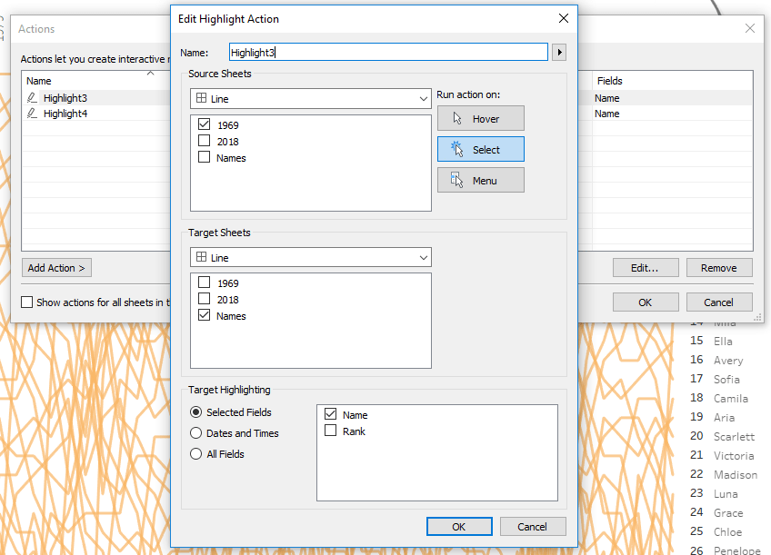
I created a corresponding highlight action for the 2018 list.
Further user activity was added by clicking on the drop-down arrow on the bump chart and adding a highlighter on Name.

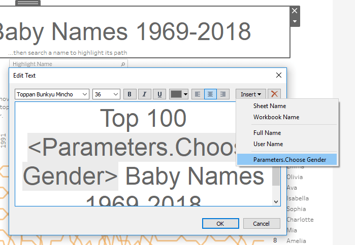
Then also doing the same thing to insert the parameter into the dashboard, and then finally inserting the parameter into the title so that when the user selected their desired gender, the title would update:
I then rounded out the dashboard with some instructions and a few arrows to show where to click. (Another neat bonus was finding that by clicking on a year, it highlighted each mark under that year effectively creating a column of the top 100 names for that selected year.)
So that was it. After a couple of days of playing around (and a whole lot of googling in between) I had some clean up to do on test calculations and deletion of unused sheets and it was ready to publish.
I really like this viz for two reasons. One, it is very straightforward and allowed me the first opportunity to create something with the basic functionality of parameters, fixed LODs, user interactivity with inserted highlighters, and dashboard actions. Two, it was an exploratory-type viz, which I think is my style. I like the ability to click around and discover cool things about a data set through visual interaction. This type of viz has come back several times in more recent dashboards that I’ve published on Tableau Public.
