
Jitter bar charts
The following are some ideas for creating interesting bar chart effects using jitter plots. Previously, Toan Hoang of Tableau Magic has written about jitter bars using two dimensions of random() for a nice effect. Below I introduce modifications on creating jitter bars using random() and index() along with playing with sizing and color to customize…

Clear all filter-action selections with a single click
In the previous post I showed how to keep track of filter-action selections by creating a list. This is fine for making the selections. But what about de-selecting? Typically the user would need to go back and find each of the marks they clicked and click on them again to deselect. However, here we can…

Keep track of filter actions with a selections list
In Tableau, an alternative to the default filter is to use a dashboard filter action. In this functionality, selecting marks in a source sheet will filter the view in a target sheet. But what if you have multiple source sheets as potential filters? Even with just two or three source sheets it can be difficult…

Data Analysis Documentation Tool
This tool is meant to help you organize and document an analysis project and increase the chances of a project’s success. Taking you through a project life-cycle from asking business questions to presenting insights, the tool covers the major stages of any analysis project from a high-level, repeatable, comprehensive process. I based the tool conceptually…

How to make a Calendar Timeline in Tableau
There are many unique ways to make timelines using Tableau. There’s: the classic the curvy the scrolling lollipops gantt charts vertical timelines classic timelines half-circle or bubbly timelines stacked bars and bump charts There’s all kinds of calendars too: as squares gantts single months Planners and other planners Using parameters and more parameters and with…

Making a directory with table pagination
Mark Bradbourne’s Real World Fake Data (#RWFD) initiative inspired me this week to try and make a directory from the Human Resources (HR) data set. I knew I would need some kind of pagination, so I ventured out into the interwebs for a look. Luke Stanke’s imaginative post popped up and I set to work…

Holiday lights display guide map
A couple weeks ago when looking for data on holiday light displays, I came across a website that showed a list of different houses and locations in Minnesota that were displaying lights this holiday season. The website had a little map made with batchgeo, showing the locations of displays as well as a table view:…

Behind the viz: Sketching pay inequality
This was an idea I had for the #MakeoverMonday week 37 topic, but didn’t have the tools to make. Having recently got an apple pencil, I decided to revisit this week’s topic and see if I could put the idea to, well, e-paper. The data set comes from the School Workforce Census conducted by the…

Dynamic Fields in a Tooltip
When you have measures or dimensions that are only applicable to some of the marks in your view, you can use a simple calculation to–in effect–make multiple different tooltips with each being relevant to their respective marks. Let’s dig in to an example. In my example, I have a scatterplot with each mark having an…

Refer to different sheets in a tooltip
[Edit: The following sadly only works in Desktop and will not work once published to Server, Online, nor Public. Thanks to Ken Flerlage for pointing this out.] It is possible to show different sheets in a tooltip depending on which mark you hover over. The trick is to use the Tableau code generated from inserting…

Behind the viz: Operation Fistula and #GivingTuesday
This week’s #MakeoverMonday viz was for #GivingTuesday and in support of Operation Fistula and the work they do to support surgeons providing surgeries for women. I decided to highlight the incredible impact that a successful surgery can have for a woman who is now able to get back to the life she wants to live…

Figma Fonts: Collection B
For anyone who also has spent a ridiculous amount of time searching for fun fonts in Figma and wants to cut the line next time, here’s a curated list of silly fonts: You can see a list of more “normal” fonts here, in Collection A.

Figma Fonts: Collection A
The design tool Figma comes with several hundred fonts to choose from. However, there currently isn’t a way to preview the font in the drop-down list. Over time I’ve looked through the list, and I’ve picked out a number that I like. If you see something here you like, just type in its name in…

Add polygons to a scatterplot for visibility
Scatterplots are great, but what if you have a lot of marks clustered together? It can sometimes be difficult to pick out the x- and y-axis values, as well as make your marks stand out. Enter polygons. As an add on to a scatterplot, four-sided polygons can make the axes’ values and the marks more…

Reveal marks with a click to drive the story
You can introduce marks within a single chart one at a time (or in groups) through the use of a parameter action. And, by adding narrative points to your data, you can create an interactive user experience that drives a chart’s story. Here’s an example of what that looks like: Here’s the demonstration:

Scrollytelling with Tableau
“Scrollytelling” is a type of visual storytelling. In contrast to a dashboard or viz’s static screen, a scrolly-told story develops as the reader–you guessed it–scrolls down their screen. Scrollytelling has grown quite popular in the last few years, especially in online journalism. In fact, the Washington Post’s most read article of all time is a…

Make a button with a set and set action
It’s possible to swap buttons with a set and a set action by: Choosing a dimension with two members or filtering down to two members Creating a set with one of those members in the set Changing the mark type to shape Placing the set on columns Placing the dimension that is in the set…

Rounded-tip bar charts
A disclaimer: this is a very “low-tech” solution, and does not contain any fancy calculations. If someone else wants to take up the challenge of making true rounded-tip bar charts, let me know! It is necessary to state up front these are NOT “rounded bar charts.” These are “rounded-TIP bar charts.” There is a significant…

What is Seasonal Adjustment? Part 1
In this week’s #MakeoverMonday challenge, we were presented with a data set from the UK’s Office for National Statistics (ONS). In both the Makeover Monday’s and ONS’s data set pages, there is very little description other than the data set’s title, “UK visits abroad: All visits Thousands-SA.” It is extremely important to note that the…

Custom Dimensional Slope Chart
In this post, I’ll be presenting the slope chart (or slope graph), showing some examples of how it can be presented, and proposing a unique way of splitting the chart across dimensions of your own choosing. What is a slope chart and when should I use one? A slope chart is a good option when…
Turn Labels On and Off
Overview You can give the user the power to turn labels on and off by making use of a sheet-swapping parameter. The sheet-swapping parameter technique has been around since at least 2015 and has since been improved upon with the show/hide icon functionality (Ryan Sleeper) and parameter actions (Keith Dykstra). The following simply uses the…

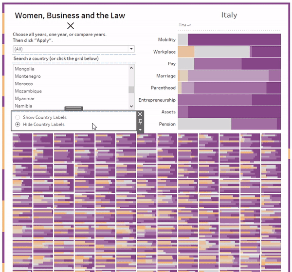
Filter alternative
Overview Instead of using Tableau’s standard filter to filter a dimension in a view, you can create a filter from a separate worksheet that displays the members of the dimension as a list. In certain use cases I find this option to be far more powerful than using the standard filter. Specifically, this filter alternative:…

Making a ‘Thankful’ Viz
Visit the viz on Tableau Public. Recently I’ve been trying to purposefully think more about the things I am thankful for and adopting a posture of gratitude. There are a lot of little ways to remind yourself to be thankful. Some people journal them when they wake up. Some post little notes on the mirror…

“Small-Multiples/Callout” Viz
Overview When each little chart within your small multiples chart (aka trellis, aka tile chart) contains too much detail to be fully absorbed from a distance, it can be helpful to incorporate a “Callout” view into your viz. The Issue Most small multiple charts I’ve seen contain the labels right in each little chart. This…

Dynamic Borders
During a recent #MakeoverMonday challenge, I thought about the idea of using a view of the data in the title somehow, purely as a design element. There are many ways this could be done, and any number of chart types could work, depending on how you want it to look. I got the idea because…
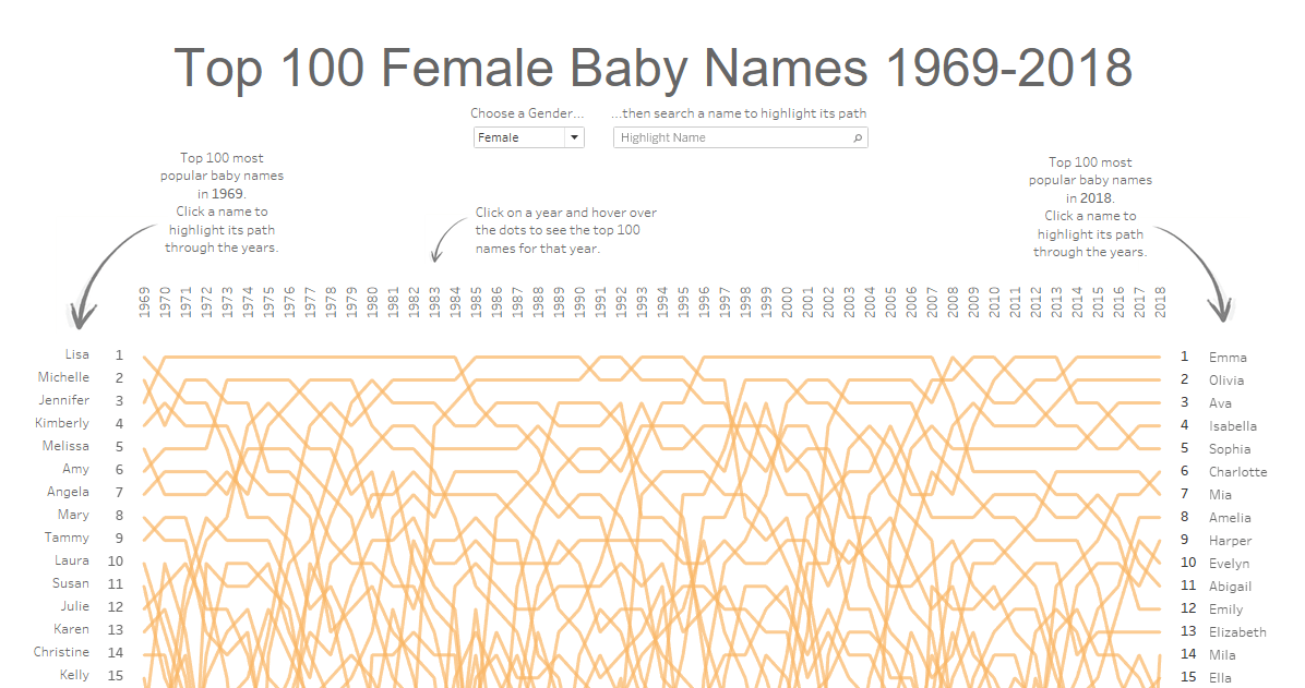
The Baby Bump Chart
The following post is about the process of creating the viz Top 100 Baby Names 1969-2018. Click to view the interactive viz on Tableau Public! In my first several months of using Tableau, I did so exclusively for work-related projects. Most of it revolved around preparing reports of counts and descriptive statistics, and all entirely…

My “first” Tableau Public viz
Below is my “first” Tableau Public viz. Click the picture to go to Tableau Public to interact: For many of you, this is an already-known, super-simple tip. But I share this with you in order to talk through my process of discovery and how I have evolved over time in my use of Tableau. I…

The Icon
As I was brainstorming with my wife for a name for this blog, she suggested I also come up with an icon that would represent what this blog is about. On the theme of “views,” the idea of a sun rising above the horizon jumped to mind. I quickly made this sketch: I feel like…
Why another dataviz blog?
I asked myself the same question. I’m new to data visualization, a little over a year in. I have spent that year as a consumer, greedily sucking down whatever resources I could come across on the web. And there are a lot of fantastic resources out there (I’ll dedicate a post to the blogs I…
