
In this post, I’ll be presenting the slope chart (or slope graph), showing some examples of how it can be presented, and proposing a unique way of splitting the chart across dimensions of your own choosing.
What is a slope chart and when should I use one?
A slope chart is a good option when you want to compare the values of a measure of two members of a dimension or two points in time. Here are examples of each:
A two-member slope chart by Gary Collins:

A two-points-in-time slope chart by Marc Reid:
The problem
Even when a slope chart may be a good way to compare two values, the data is sometimes too clustered for the slope chart to be readable. Take this recent #MakeoverMonday data set as an example:
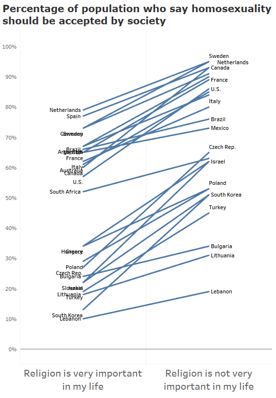
The purpose was to compare the views of religious and non-religious people on whether homosexuality should be accepted by society. While this is not the only way to display this information, the slope graph lets us quickly see that in the 25 countries included, the non-religious tend to agree more that homosexuality should be accepted. We can also quickly see that for some countries, the difference in views between the religious and non-religious are larger (ie, a steeper slope).
Yet, there are too many marks to make this an optimal chart. So, we need to figure out some ways to make it clearer.
Solution #1
One thing we could do is highlight only a few of the marks:
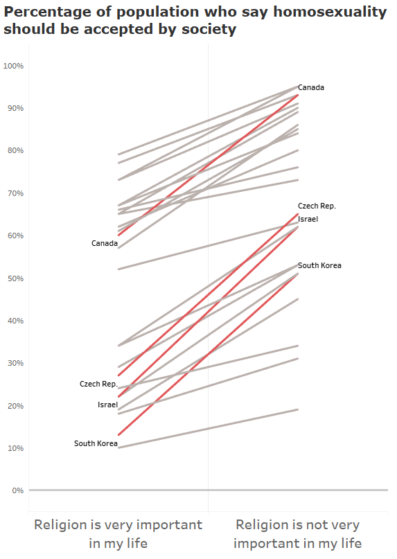
This is a little better, but it’s still too cluttered.
Solution #2
One way to work around this is to add interactive highlighting. Brian Graves created this “before and after” slope chart with the ability to allow the user to highlight categories of slopes. It works really well for this ranked slope chart.

Solution #3
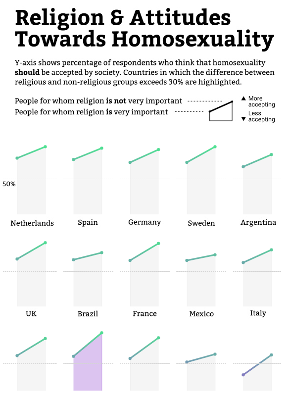
A common solution is to create small multiples of the level of analysis, which in this case is country. Gordon Hack presented this data set beautifully with this small multiple viz:
Solution #4
There can be other ways to do this, however. A very creative solution for this #MakeoverMonday viz was provided by Takafumi Shukuya. Here he added a lollipop chart to the right of the slopes to show the degree of change:

Solution #5
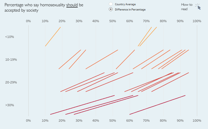
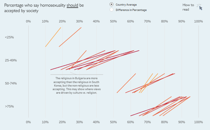
Slope charts can also be split out based on other dimensions that may exist in the data set such as region:
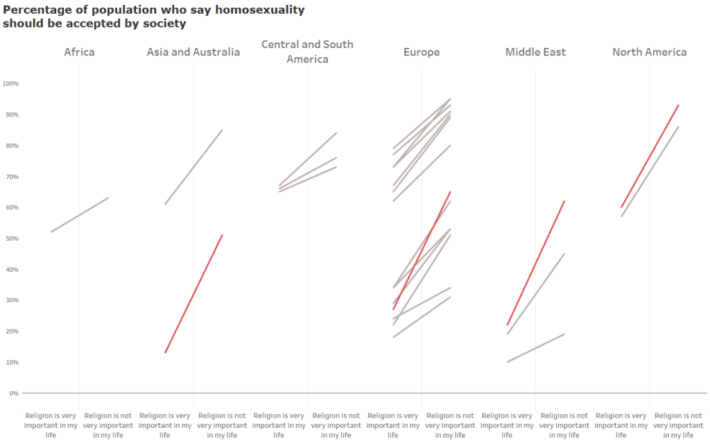
Because all lines are compared on the same y-axis, it is easier to gain insights about this selected dimension. Comparing North America with Central and South America we see that the religious in North America are less accepting of homosexuality, but the non-religious are more accepting. There is a bigger divide in North America between the religious and non-religious.
We can also now more easily compare lines of similar slopes. Lebanon (the lowest line) has a similar slope to Brazil and Mexico (the lowest two in Central and South America), yet the overall acceptance rate is much lower in Lebanon. Perhaps the differences in culture, rather than religion, explain the views held in these countries.
Solution #6
Creating custom dimensional slope charts
We can also choose to group these lines based on any grouping of our choice.
Example 1
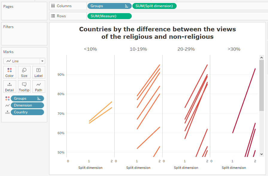
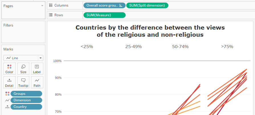
Here’s the first example, with the countries grouped by the steepness of the slope (ie, the degrees of difference between our two members of the slope chart dimension):
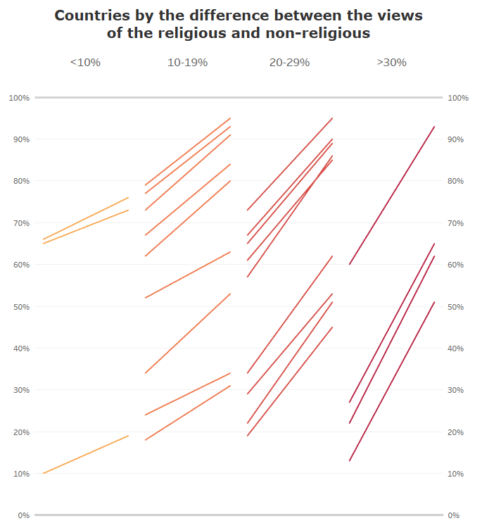
The advantage of breaking up the lines by their slope is that there isn’t as much crisscrossing of lines. And because all marks exist on the same y-axis, they can still be compared easily by looking horizontally. As we’ll see, another advantage of creating these custom dimensions is that you can control the distance between the members of the dimension.
The disadvantage is that it is no longer explicitly clear in the chart what each end of the lines represent. You will want to use a legend or annotations to show this, and I’ll provide an example of that a bit later. (Gordon Hack also used a legend in his small multiples viz.)
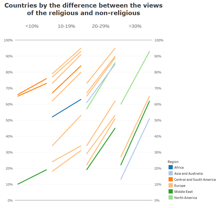
You may choose to color or size the lines based on an additional dimension, such as region. The following is for example sake only, and you’ll want to carefully consider the number of members/colors to choose:
Ok, so how is this done in Tableau?
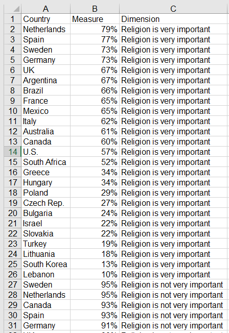
The first step is to arrange your data. You will need to pivot your data if the members of slope-chart dimension are originally in separate columns. (In this case, “Religion is very important” and “Religion is not very important” were in separate columns originally.)
After connecting to your data, create the following calculation:
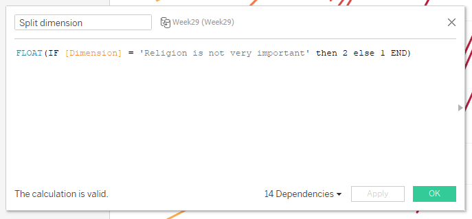
It’s important to make this measure a float (ie, a number with places after the decimal) because it will allow us to control the spacing between groups of our chosen dimension.
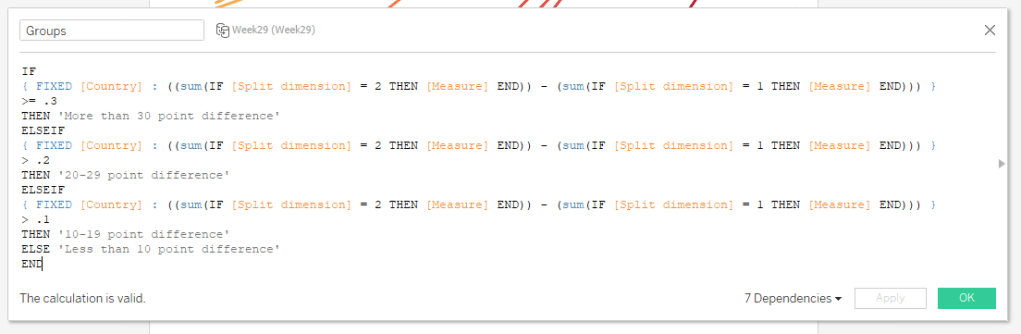
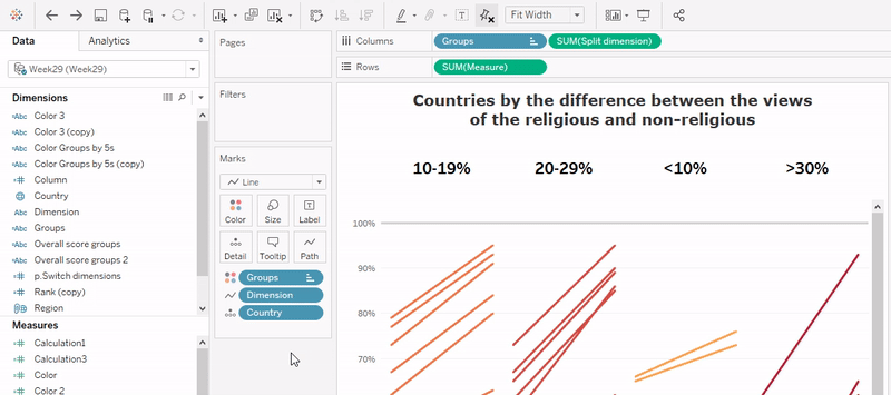
Next, we will create the groups of our custom dimension:
Build the view by placing your ‘Groups’ calculation on columns, then your ‘Split dimension’ calculation next to it. Place ‘Measure’ on rows. Set the marks to Line, put ‘Dimension’ on Path, and ‘Country’ on Detail.
Now we just need to play with the axis and formatting to get the look we want. Fix the ‘Split dimension’ axis, and then hide the header.
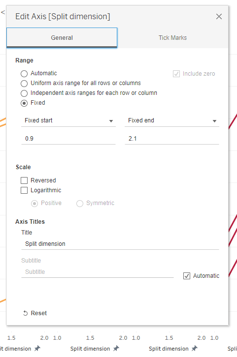
Fix the ‘Measure’ axis to get the percentages to format evenly spaced. (This tip is courtesy of Sam Parsons.)
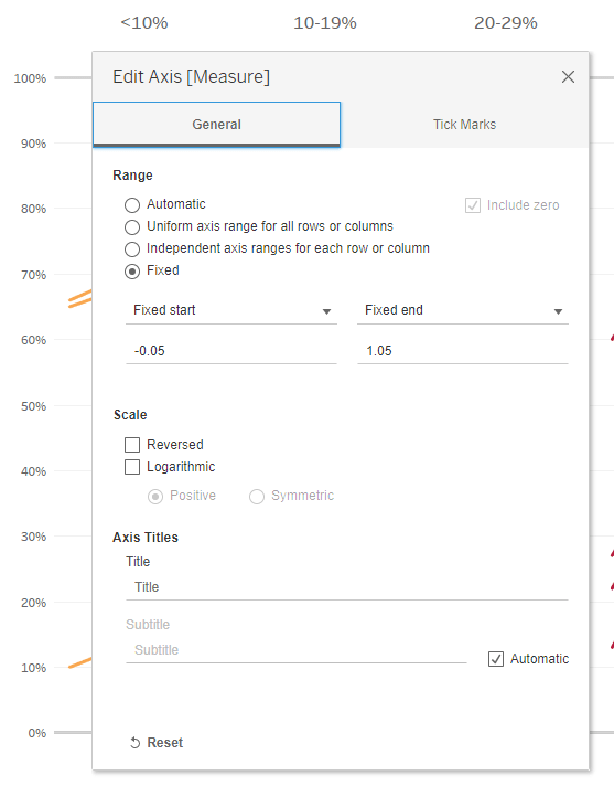
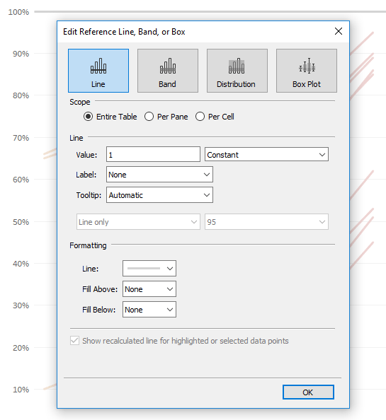
Lastly, (and optionally), I added two reference lines, one at 100% and one at 0%, to indicate the minimum and maximum values since this measure was out of 100%.
This isn’t best practice or anything, but in the case of my final viz, I chose to swap the columns and rows:
Voila!
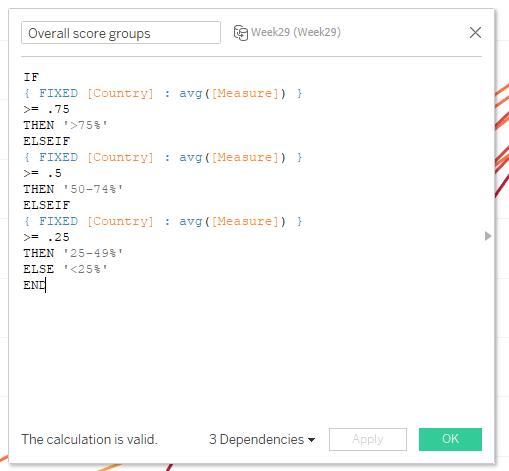
Example 2
Another way I chose to group the slopes was by the overall average score for each country. Here’s the calculation for that view:
The only thing you need to change in your sheet is the first blue dimension pill on the columns shelf:
(Pro tip: To swap the blue pills, instead of dragging and dropping the new pill on the shelf, double click in the pill and type in the name of the new pill you want. This will preserve all of your formatting!)
Again, swapping the columns and the rows, we have:
Recap
To recap, slope charts can be a good choice when you want to compare two values of a measure between two members of a dimension or two points in time. When slope charts are too clustered to make them readable, there are a number of ways to present the view:
- Highlighting
- Interactive highlighting
- Small multiples
- Adding a second chart (Lollipop example)
- Grouping by another dimension
- Creating custom dimensions
For solution #6, click to view the custom dimensional slope chart viz and download the workbook to see all the steps in action.
