In this week’s #MakeoverMonday challenge, we were presented with a data set from the UK’s Office for National Statistics (ONS). In both the Makeover Monday’s and ONS’s data set pages, there is very little description other than the data set’s title, “UK visits abroad: All visits Thousands-SA.” It is extremely important to note that the “SA” in the title stands for “Seasonally Adjusted.”
This wasn’t immediately clear to me when I downloaded the data set, but became apparent after a couple exploratory charts. Check this one out from the Makeover Monday data set:

It’s pretty incredible that the month of the year would have almost no effect on the number of visits abroad. Don’t people tend to travel more during summer vacation? What about holiday travel? This is when I decided to dig more into ONS’s data sets.
There you find another data set titled, “UK visits abroad:All visits Thousands-NSA.”
Ah. “NSA” means “Not Seasonally Adjusted.” Up until now, we’ve been looking at the “Seasonally-Adjusted” data.
Here’s the same chart using the NOT-seasonally-adjusted data:

We can see a big difference between the two charts. The first chart is seasonally-adjusted. The second chart is not. We must use the second chart with the actual estimates of visits to analyze monthly visits.
Using this not-seasonally-adjusted data set, we can now make a heat map:

Historically, August has been the most popular travel month followed by September. Despite Christmas falling in December, December is actually the least popular month for travel abroad. (Perhaps there is more internal travel as people get together with family within the UK for this holiday.) June through October have been in the top six most popular months all 34 years.
So what is “Seasonally Adjusted” exactly?
Seasonally adjusted data uses statistical techniques to “smooth” the seasonal patterns that occur in time-series data. These techniques literally change the numbers so that the underlying trend is more apparent. In general, months with a historical pattern of more visits are adjusted downward, and months with a historical pattern of fewer visits are adjusted upward. This is why we cannot use SA data sets to show the actual estimates for each month.
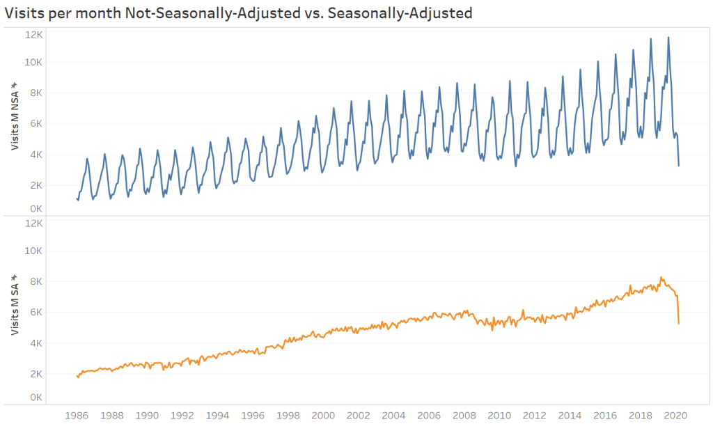
I will save the discussion on the statistical techniques and the differences between NSA and SA for Part 2. For the purposes of this post, see the following two charts, the first with not-seasonally-adjusted data and the second seasonally-adjusted.
When to use NSA vs. SA
The key to thinking about this are the words “Pattern” vs. “Trend.”
Not-seasonally-adjusted data can show us the pattern, but seasonally-adjusted data better show us the trend.
Sure, by eye-balling the NSA data we can see that the 2008/2009 financial crisis had a negative effect on visits abroad, but it is not as good as the SA adjusted data in showing us more specifically when this trend started and when we came out of it. (Or at the time, what forecasts predicted. Forecasts are better made from seasonally-adjusted data). Policy and decision makers rely on this more-detailed look when planning for the future.
Airline executives will want to know what the future trend is when planning how many planes and flights to keep available, and they will also need to keep in mind the pattern so that they can still be ready for the ramp up to each August.
Here’s another shorthand for what data set you want:
When you need to know the actual estimates of whatever data you are looking at, use NSA.
The Makeover Monday data set (adjusted) does NOT tell us how many visits occurred each month. It shows us the seasonally-adjusted trend. Look at the chart again, zoomed in this time with labels:

The NSA (pattern) shows that there were 8,717,000 actual estimated visits in August 2011. Since there is a pattern of more visits in August, the statistical seasonal adjustment method smooths this down to 5,680,000 adjusted visits. Likewise, in December 2015 there were 4,076,000 actual estimated visits. Since historically December has fewer visits, this number gets adjusted up to 6,170,000.
From the top chart we can see that there were fewer visits in December 2014 than there were 3.5 years prior in August 2011. But from the bottom chart (seasonally adjusted data) we can see that the trend in travel is going up (5,680,000 in August 2011 to 6,170,000 in December 2014). These trend numbers (bottom chart) should not be thought of in actual number of visits for their respective months, but only in relation to each other, i.e. the trend.
It must be made clear to our viz readers that the data we are showing are Seasonally-Adjusted and do not show the actual estimates of how many visits were made.
And, it is important to know what you can show with SA vs. NSA data sets. If we use the SA data set to show the most popular month, it will look like November is the most popular month, which is not true. August actually is.
Stay tuned for Part 2. And if you want to read ahead, see these two helpful articles:
