A disclaimer: this is a very “low-tech” solution, and does not contain any fancy calculations. If someone else wants to take up the challenge of making true rounded-tip bar charts, let me know!
It is necessary to state up front these are NOT “rounded bar charts.” These are “rounded-TIP bar charts.” There is a significant difference, which I will get into below.
To make this clear, here’s a comparison of a rounded bar chart and a rounded-tip bar chart:
Rounded Bar Chart

Rounded-Tip Bar Chart

The first, a rounded bar chart, is a well-established chart type with many how-to examples on the interwebs. There are two main ways to make a rounded bar chart either from a line chart (see Anthony Smoak) or a dual-axis chart with bars and circles (see Ryan Sleeper).
Both, however, suffer from the same issue; rounded bar charts do not accurately display the measure value.
The issue with rounded bar charts
Rounded bar charts look pretty. There is nothing wrong with that. In fact, this is a big reason to use rounded bar charts, and you will find many opportunities to do so. However, if the goal is to be absolutely precise in displaying measure value–both within a single bar and in comparing the values of bars–a rounded bar chart can be misleading.
Both of the methods of creating rounded bar charts suffer from the same problem. In both cases, the measure value ends where the bar starts to curve.
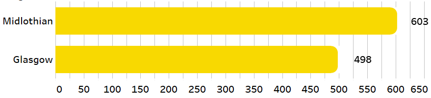
This is most obviously shown with the dual-axis, bar-and-circle method.

See what’s going on here? The axis and the labels don’t seem to agree with each other. Let’s take a closer look.

For Glasgow, the value is 498. This is where the bar ends. And, this is the mid-point of the circle. This is important to keep in mind when designing any viz with shapes. Tableau positions shapes so that the midpoint aligns with the value of the axis. (For the x-axis, it’s the “horizontal” mid-point, and for the y-axis, it’s the “vertical” mid-point.)
Making a rounded-tip bar chart
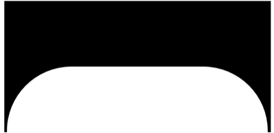
We can use this knowledge to our advantage to make a rounded-tip bar chart where both label and axis are aligned. The secret is in knowing that the shape is centered at the mid-point. All we need to do is create a shape whose mid-point will fall at the exact same place as the flat end of a regular bar chart.
Here’s the shape:

I created this with PowerPoint (the proletariat’s design tool!). The left edge in the middle of the shape butts up against the exact horizontal mid-point of the shape overall.

This way we can be sure that the far right edge of our regular bar will be fully displayed, just up to that flat part of the inside of the shape.
The rest of the steps are exactly the same as the second method of creating the rounded bar chart with a dual-axis, bar-and-circle chart. (You will have to play around with the size of the shape to get the rounded corners just right. And don’t forget to synchronize your axes!) The only extra step is to color the shape with the same color as the sheet (or background) so that the bars look like they have rounded corners.

Now we have a rounded-tip bar chart!
The issues with the rounded-tip bar chart
This method, however, is not without its drawbacks. There are two things I don’t like about it.
One, because it is made with a shape, and because the shape is colored the same as the background, it covers over any grid lines that are in its way, which makes it look a bit odd:
Two, interaction looks a bit strange as well, because there is this funny “invisible cap” at the end of the bar:

With that being the case, it may be better to use this method for a static viz.
Since for my #MondayMakover viz I wanted a static bar chart to begin with, I decided to add a little bit of pizzazz by rounding the tips and then covered the whole chart with a blank object. You can view it in Tableau Public here.

Four shapes
If you would like to use this in one of your vizzes, feel free to copy these shapes. I just kindly ask you to credit the icons and mention me if you’re on Twitter. (I’m @_LutherAF_) I will love to see what you make! You can even play around with the height or width of the shape, or use the concept to make your own unique shapes.


Now the challenge is for someone to figure out a way to make a rounded-tip bar chart that will avoid this method’s drawbacks while still displaying the correct value. (And maybe someone already has?? Let me know if you figure it out!)
