
“Scrollytelling” is a type of visual storytelling. In contrast to a dashboard or viz’s static screen, a scrolly-told story develops as the reader–you guessed it–scrolls down their screen.
Scrollytelling has grown quite popular in the last few years, especially in online journalism. In fact, the Washington Post’s most read article of all time is a data story, told visually through scrolling.
Research has shown the effectiveness in engagement with visual stories told through scrolling, but we can probably assume this conclusion–there’s a reason social media platforms such as Facebook, Twitter, and Reddit have scrolling feeds that go on forever.
One of the most common methods for creating web-based scrolling stories is the JavaScript library, D3. (And in combination with other JS libraries.) The mix of HTML, CSS, and JS can be used to create efficient, beautiful and engaging data stories as the viewer scrolls down the page. The popular data journalism platform, The Pudding, has many examples of scrollytelling done well through the use of D3.
Tableau is not D3, and Tableau was not designed to be a browser-based scrollytelling platform. Tableau’s selling point is its offering of easy entre to dashboard design and data analysis for business users. But because a Tableau view is a Cartesian plane (a set of axes), Tableau can be used to make anything you can draw on a piece of paper. That means with enough creativity and gumption, you can make a scrollytelling viz.
There is an unlimited number of ways to tell a scrolling data viz story. I know I’m not the first to do so–while looking for other examples of scrollytelling in Tableau I came across this example by the interworks team published back in March 2020. I didn’t see this viz until after I completed mine, and if I had I probably wouldn’t have attempted to try it on my own since the interworks team did it so brilliantly. There’s a ton of stuff to glean there, so I encourage anyone making a scrolling viz to download it and peek under the hood.
My take on scrollytelling with Tableau: Cascading marks
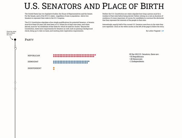
Some weeks ago I had the idea to make an animated map that showed U.S. Senators birth state versus the state they represent. I then wanted to make a bar chart below the map. Then I thought, “What if I could get the marks on the map to turn into the marks for the bar?” This thought quickly escalated out of control until I had an entire scrolly-told viz from top to bottom, with the marks “cascading” down the screen.
This idea of cascading marks became my constraint and what I designed my viz around. And so, setting aside all the other potential ways to make a scrollytelling viz, the cascading marks type is what I will be describing from here on.
(The topic of Senators and place of birth is a bit of a soft one, but the point here is to show the concept of scrollytelling and not the topic. For you, the reader, I really look forward to what ideas are sparked in your mind and the scrollytelling creations you make.)
Alright, so jumping in, here’s how my Tableau scrollytelling viz looks:
Here’s the link to the viz on Tableau Public. Unfortunately, there is a ton going on in this viz and it is not optimized well enough to render the animations on Tableau Public’s server. But if you like, please give it a download to see how it’s built. [EDIT 10/23/20: After trying a suggestion from Adam Mico, the animations are working! His advice was to use the workbook default animation rather than turning animations on for individual sheets. After doing this, as well as changing the blank sheets from polygon to automatic, the animations are working smoothly in Tableau Public. Thank you Adam!]
There is a number of things going on here in this dashboard to get at the overall user experience:
- Data scaffolding in the data set, or a repetition of your data set for every “position” you want to see your marks in.
- A single sheet (with the dots) that runs the length of the dashboard.
- Filter actions on the line running down the left hand side which when clicked make the dots move.
- Parameter actions on blank, white sheets which disappear to reveal underlying text.
- Headers as coordinates on shape so that they can fade in and out.
- A similar treatment of sub-headers yet with filter actions to get them to move.
- Duplicate views of the maps with transparent marks so that tooltips will still work.
- A background image for the tile map and some text for consistent fonts.
For the rest of this post I’m going to focus on numbers 1-3, since these are the essential pieces to making a scrolling viz with cascading marks.
Cascading marks require animations
But before we talk about those, we have to talk about the functionality that makes this all possible: animations.
To get the cascading to work, you need to consider two concepts when it comes to animations in Tableau: 1) the use of mark IDs and 2) the fact that “measures move.” The first concept is explained fully by Marc Reid in his post Tableau Animation Core Concepts. Essentially, for a scrolling viz to follow a single mark from top to bottom, that mark must have the same ID all the way through. The second concept is demonstrated in detail by Liam Spencer is his post on “Complex” Tableau Animations. This means that the position of the marks must be determined by a measure. The way to do this is with coordinates, or X and Y measures on the columns and rows shelves.
Now that we know this, we can outline the steps for making a cascading viz:
- Draw the grid
- Scaffold the data
- Make the main sheet
- Create the filter actions
Clicking vs. Hovering
There are two variations of the cascading scrollytelling viz. Variation 1: Filter actions running on select. Variation 2: Filter actions running on hover. The “Senators” viz was made with the filter action running on select. Specific buttons on the viz are provided for the user to click as they scroll down the page. The clicking initiates the cascading.
With Variation 2, you can create a user experience where the marks move as the user scrolls down the page. This is done by initiating (or running) filter actions on hover.
Either variation has its plusses and minuses. Out of full disclosure, with Variation 2 you will lose tooltips and the user will not be able to click on any of the marks. (See the discussion section below.) Yet, I really am drawn to Variation 2 because this has a much closer feel to a true scrollytelling visualization. If you choose to do scrollytelling through clicking, download the viz above. If you want to do scrollytelling through scrolling, continue reading (or watching) on.
I put together a video walkthrough of these steps using Variation 2. It may be helpful to watch the video and read below in combination. Or if you like just watch the video and skip the below. Or vice versa. Or you could even download the workbook and reverse engineer it that way.
Draw the grid
You first need to determine what you want your viz to look like over the entirety of the scrolling viz from top to bottom. Each data point will need a coordinate for every position.
There’s no one right way to do this. You could sketch out the viz on graphing paper. You could plot the data points in each position, then transpose each position to determine the coordinates for each mark. You could write some code to tell you the coordinates of each mark. However you do it, you will need to end up with an X and Y value for every mark.
Scaffold the data
At this point you will have a determined number of “positions” of your data points in your scrolly-viz. In your main data set, create a new field and assign a unique dimension member to each position. Each mark within a single position will share this dimension member.
Within your first position, assign a unique mark ID to each data point. Assign these same IDs to the set of marks in the second position. Repeat for as many positions as are in your viz. It is essential that you repeat the same set of IDs because this is how Tableau will know to move a mark from one position to another.
Next you will need to create a second data set to use as a filter. This data set will consist of a single column, named exactly the same as the column you used for the position dimension in your main data set. It will contain one row for each of the positions of your data points. So if you have three different positions in your scrolly-viz, this data set will have a header and 3 rows.
Make the main sheet
In Tableau, connect to the main data set. Place X on columns, Y on rows, and mark ID on detail. You can add the position dimension to the filter shelf as a validation step. Filter the position dimension to the top most position in the viz. Double click on your X and Y axes and set them to fixed. You can remove position from the filter shelf.
Create the filter actions
Add a new data source, and connect to the filter data set. Place the position dimension on rows, change the marks to shape, and place a second instance of the position dimension on shape. Set the sheet to entire view and adjust the sizes of the marks so that they touch each other. Next, replace the shapes with a transparent, custom shape. (You will need to find a transparent square somewhere on the internet and save it as a .png file. Follow this fun blog post for how to add a custom shape to the view.)
Now you are ready to build your dashboard. Tile the main sheet, and float the (now) transparent filter sheet exactly on top. Add a dashboard filter action. Use the filter sheet as the source and the main sheet as the target. Run action on hover, and choose the option “Leave the filter” when clearing the selection. Click OK.
That’s it! By this point you’ve done everything you need to build the basic functionality of a scrollytelling visualization.
Discussion
At this point I have to state again the biggest drawback of this method. The user will not be able to click on the underlying marks, nor will the viz display tooltips. This is because the filter sheet with the transparent shapes is on top of the main sheet which has all the marks. This is a bummer.
If you follow Variation 1 above (the Senators and Place of Birth viz, where the cascading effect is controlled by clicking), you can absolutely allow for interaction with marks and show tooltips. But the trade off is it’s less of a scrolling viz and more of a control-the-story type of viz. (Credit to Chris Love and Kevin Flerlage for leading the way on these types of vizzes.)
In Variation 2 above (the LAF initials example), you lose tooltips, but I think the tradeoff of initiating the filter action as the user scrolls down the page is worth it for that effect.
A compromise could be to provide a “scrolling area” for the user, ie, direct them to keep their mouse within a certain column as they scroll down the page. But this may be too much to ask a user.
If you have any thoughts on taking this concept further, please share below! I’m looking forward to how you use these ideas and others to create scrollytelling visualizations.
