
You can introduce marks within a single chart one at a time (or in groups) through the use of a parameter action.
And, by adding narrative points to your data, you can create an interactive user experience that drives a chart’s story.
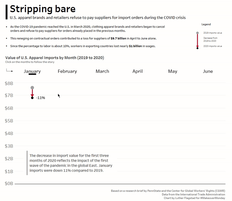
Here’s an example of what that looks like:
Here’s the demonstration:
