Scatterplots are great, but what if you have a lot of marks clustered together? It can sometimes be difficult to pick out the x- and y-axis values, as well as make your marks stand out. Enter polygons. As an add on to a scatterplot, four-sided polygons can make the axes’ values and the marks more clear to the user.
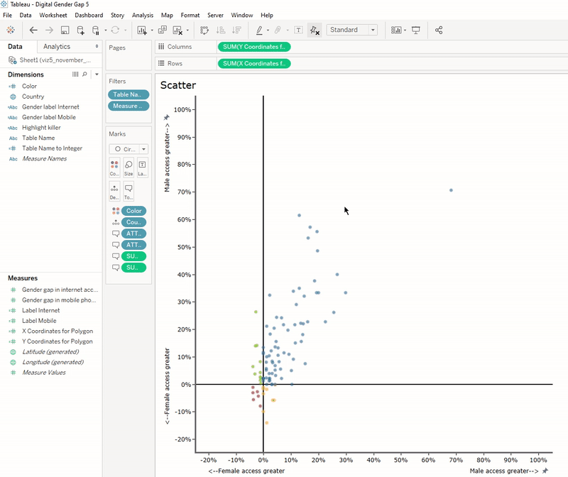
First off, here’s a look at a plain, old scatterplot:

Selecting the marks simply greys out everything else. Boring.
Of course, you can make use of a reference line to quickly see the axes’ values:
Tableau’s built in reference lines are one way to solve our problem. (Make sure to select “Show recalculated line…”) It’s a bit quotidian yet gets the job done.
Polygons in themselves can offer an alternative to a scatterplot. I won’t cover polygons in extensive detail, as there are numerous resources for how to create the kinds of shapes you want for your use case, but I will point out one resource that covers square (or rectangle) polygons and will be helpful to us for creating the scatterplot/polygon chart. The post in mention is “Yes Polygons” by Ken Flerlage. Here he covers the four-quadrant polygon chart (as well as how to build such charts without polygons–or “No Polygons”–if you will.)
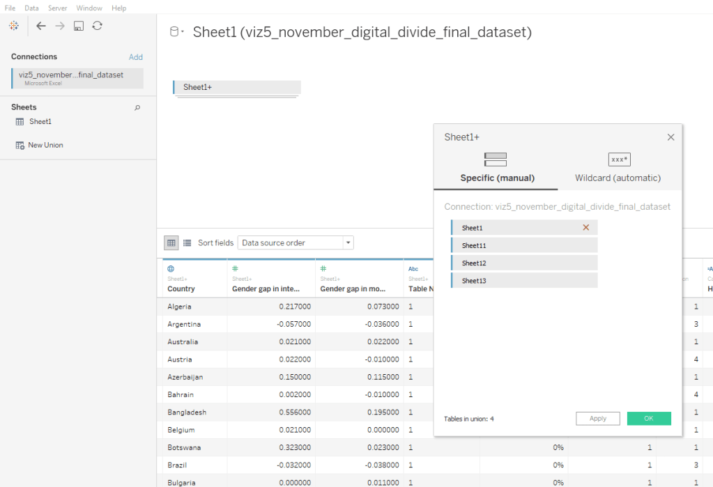
Basically, polygons require a data set where a single dimension is associated with as many points as there are in the polygon shape. So, for a rectangle, that means a single data point will need four members of the same dimension in a data set to be drawn in Tableau. This is easily achieved by unioning your data three times (so that there are four sets of the same data). When you union your data, Tableau automatically creates a dimension called “Table Name” with members for each of the data sets in the union. The following union was made by dragging Sheet1 onto the data area four times. (Tableau named these Sheet1-1, 1-2, and 1-3, but without the dash. This is why it looks like 11, 12, and 13.)
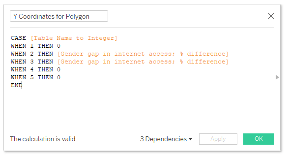
The next step is to create a calculated field that turns Tableau’s automatically-created table names field into ordinal integers. This will tell Tableau how to draw the path, plus it will make it a lot easier on you to sort out which corner of your square you are dealing with:

(Note: While not necessary to make a polygon square, I added a fifth union and a fifth point, which will coincide with the coordinates for point one. This is for if you want to draw a line around the square. When Tableau draws a line, it does not know to connect the last point back to the first point. You will need to explicitly tell Tableau to return to the first point by overlapping the last point with the first.)
The next step is to create X and Y calculated fields that associate the same data point with each occurrence of the unioned data set. Here you will need to figure out which of the four corners will correspond to which number, 1, 2, 3, and 4. I chose to make point one at (0, 0) and continue clockwise. Therefore, the points will be as follows:
- Point 1: (0, 0)
- Point 2: (0, MeasureA)
- Point 3: (MeasureB, MeasureA)
- Point 4: (MeasureB, 0)
- [Optionally: Point 5: (0,0), which returns to Point 1]

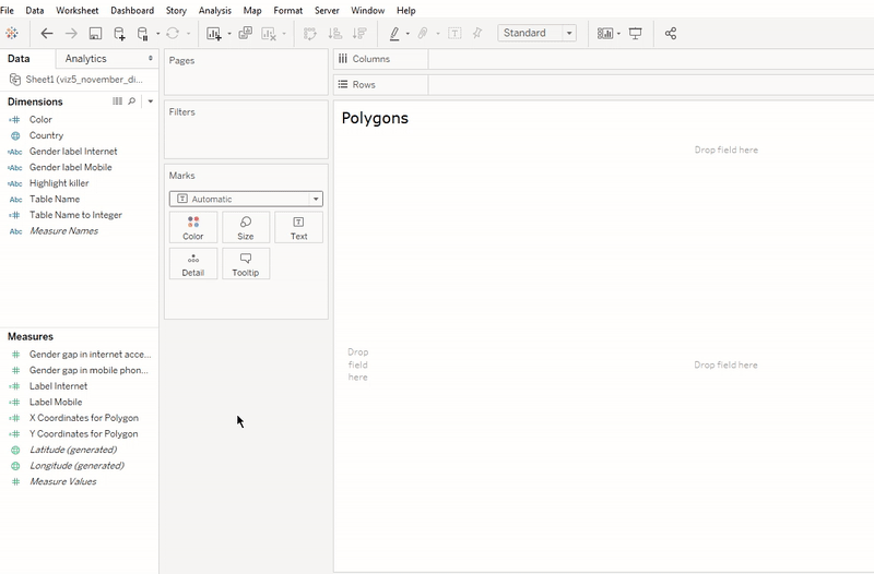
The next step is to create the polygon view.
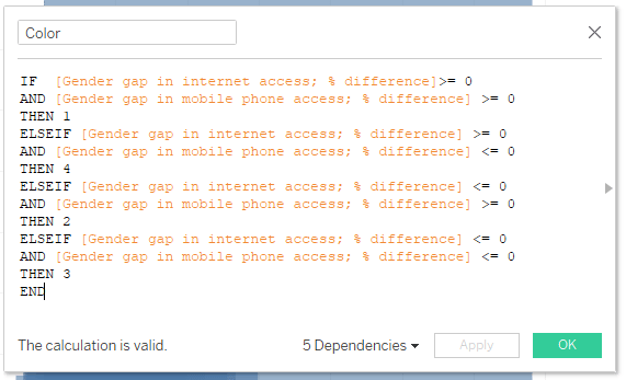
Color can be added with a calculation, added to Color:
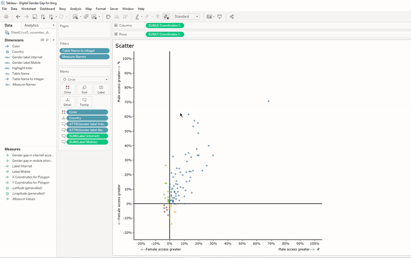
Next, create the scatterplot view. This is similar to the view for polygons:

Now we will float the scatter over the polygons in a dashboard, and add dashboard actions.
When floating the scatter sheet over the polygons, make sure the scatter sheet’s background is set to “none.” (Otherwise you won’t be able to see the polygons behind it.)
For the dashboard action, make sure the source sheet runs the action on hover, and that on the target sheet, clearing the selection will exclude all values.
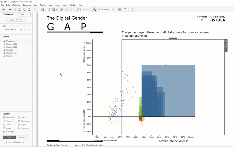
That’s everything you need to do to add polygons to a scatter plot. From here you can add whatever else you want to your viz. In my final dashboard, I also added a filter created from a list view. (See how to make this kind of filter here.) You can also download the viz from my Tableau Public profile if you would like to explore further.