
When you have measures or dimensions that are only applicable to some of the marks in your view, you can use a simple calculation to–in effect–make multiple different tooltips with each being relevant to their respective marks.
Let’s dig in to an example.
In my example, I have a scatterplot with each mark having an X and a Y coordinate. In my scatterplot, there are two distinct sets of marks: one for the posts at the beginning of each hole, and one for the golf shots. I created the final data set by unioning the two distinct sets with the X and Y coordinates being the common fields. This means that the final data set ended up with a whole bunch of fields that had data for one set and displayed null for the other. In other words, the fields relevant to the hole posts were not relevant to the golf shots and vice versa.
Goal: The goal was to create a user experience where hovering over a post would show different fields in the tooltip than when hovering over the golf shots.
Problem: This meant that it would not be possible to simply drag each field into the tooltip editor since then the tooltip would display “null” for half the fields.
Solution: The solution was to create a series of conditional statements in calculated fields, and then place those calculated fields against each other in the tooltip.
Here is what the two tooltips look like:
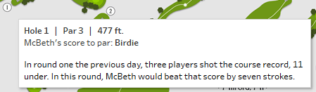

Remember this is actually a single tooltip, but with two different displays depending on what mark type is being hovered over.
This is what the tooltip editor looks like:
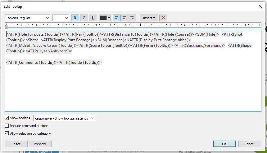
The editor has every field relevant to the hole posts and every field relevant to the shots. However, when hovering over one set of mark, half of these fields will be displaying as blank. This is the trick.
Here is the basic theme of the calculation for doing such:
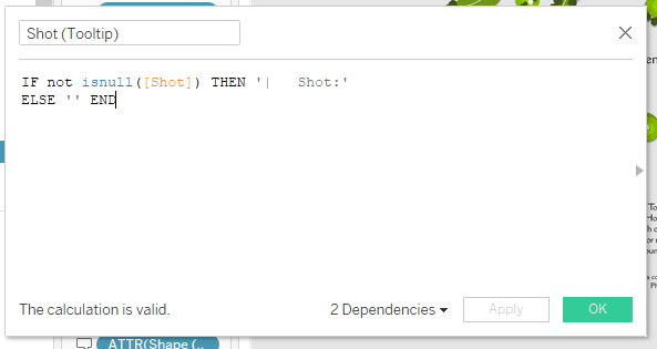
You can see that if there is data in the cell for “Shot” then the tooltip will display the header for the field, which I formatted in the way you can see between the two single quotes. This field then appears in the tooltip editor on the first line. When hovering over the hole post marks this will be blank and so will not appear in the tooltip. When hovering over the shot, it will display.
The same is true for the “Par” field, just vice versa, where the text will display when hovering over the hole post but will disappear when hovering over the the shots.
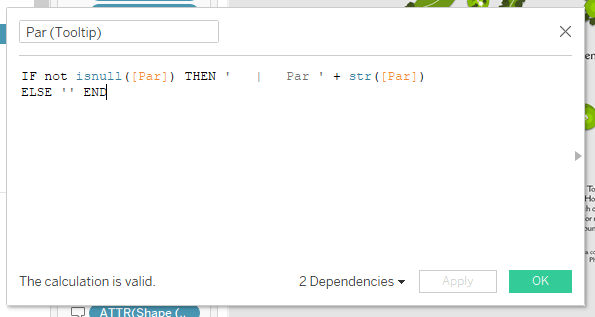
The rest of the tooltip editor follows suit with the calculated fields pasted against each other.
This was a pretty specific example given the scatterplot and unioned data sets. Yet, this concept can be applied to other contexts and scenarios wherever you want to have different sets of fields displayed in the tooltip depending on the mark.
For further illustration, you can watch the walkthrough below, or download the workbook here.
