This was an idea I had for the #MakeoverMonday week 37 topic, but didn’t have the tools to make. Having recently got an apple pencil, I decided to revisit this week’s topic and see if I could put the idea to, well, e-paper.
The data set comes from the School Workforce Census conducted by the UK government, specifically looking at teacher pay by gender. In the 2019-2020 school year we find females still yet paid less than their male counterparts. This persists across all grades, from classroom teachers to headteachers.
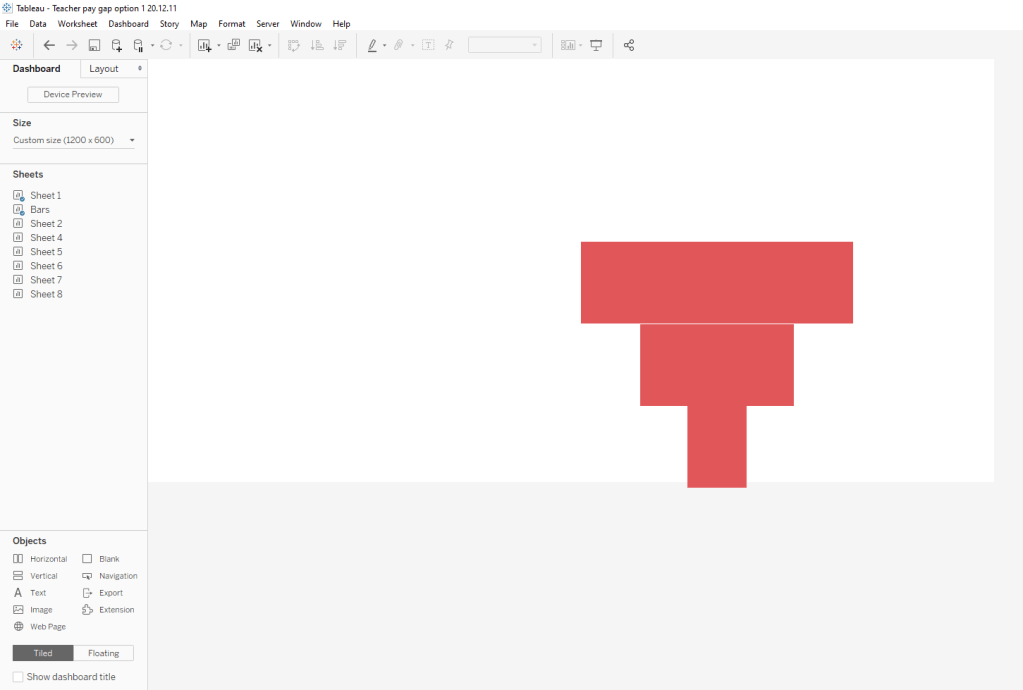
To my mind, this gap looked like a break in the career path, a physical gap in a path perhaps. And this gap widens as female teachers move up in grade.
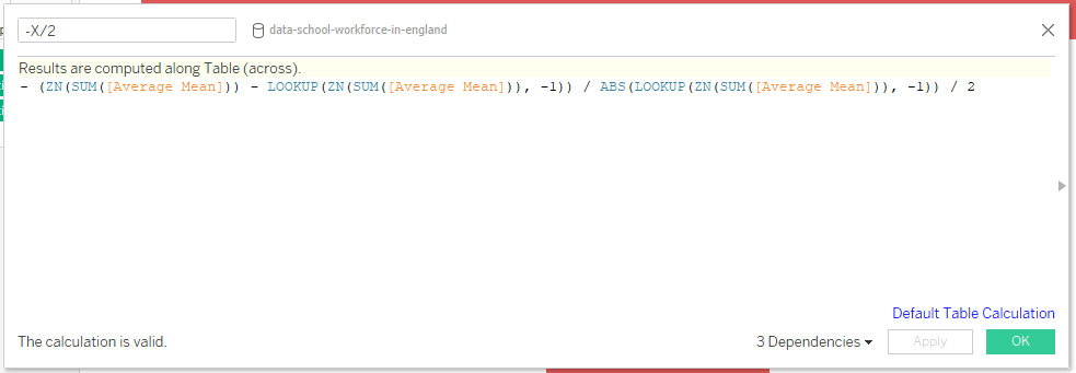
I tried out a couple different “free” sketching apps but found a paywall when trying to export to .png, so returned to my trusty design tool, PowerPoint for sketching this viz. Since I didn’t have the exact gaps to draw to, I drew the separate parts in PowerPoint for the ipad, saved them as images, and opened them in figma. I then made the bar chart in Tableau, exported the image, and opened that in figma as well. Then I arranged the parts to match up against the bar chart image, grouped the parts, and exported it as a .png, which I then inserted as an image object in the Tableau dashboard. A few moving pieces here, but it’s actually quite quick to pull it together.
Here are the steps, with images:
- In the ipad PowerPoint app, using the draw function, sketch the various parts.
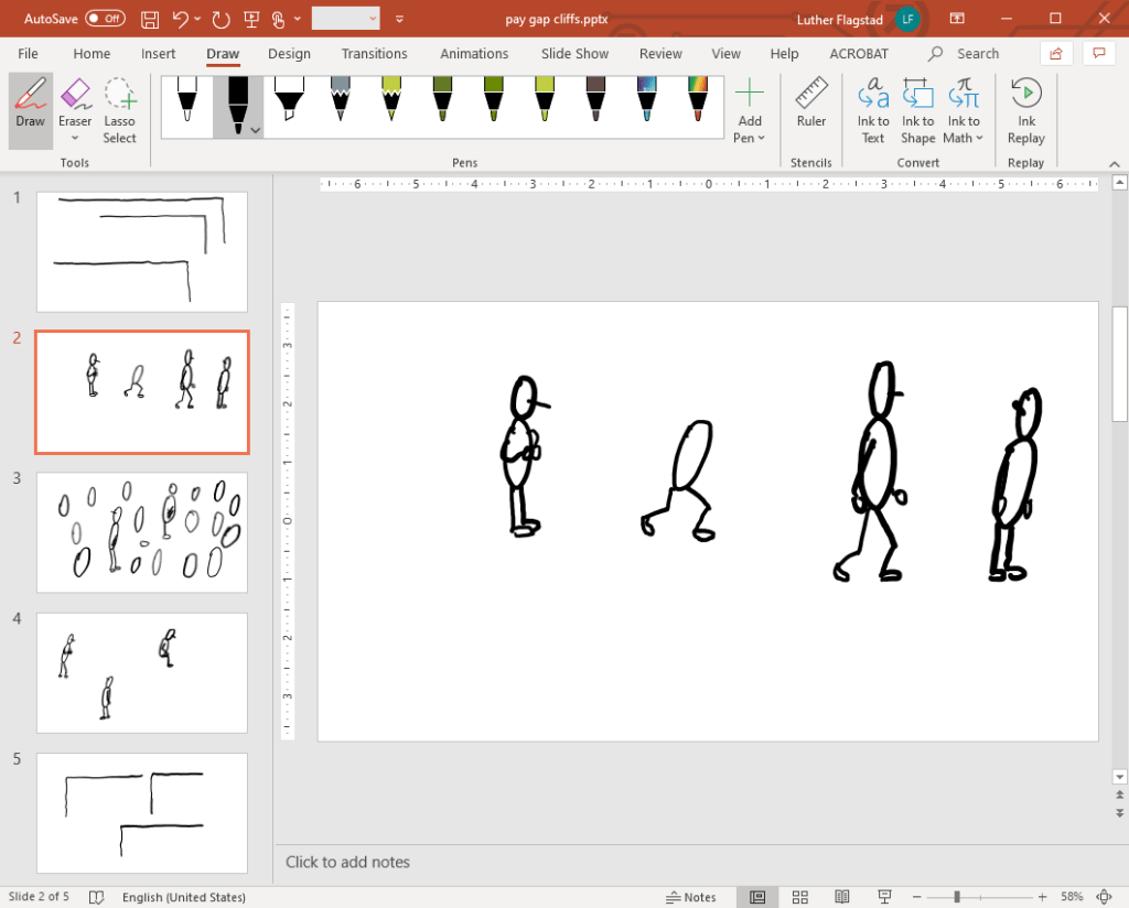
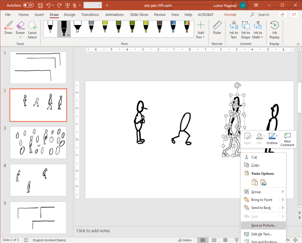
2. Highlight, right click, and save as picture. Repeat for each part.
3. Make the bar chart
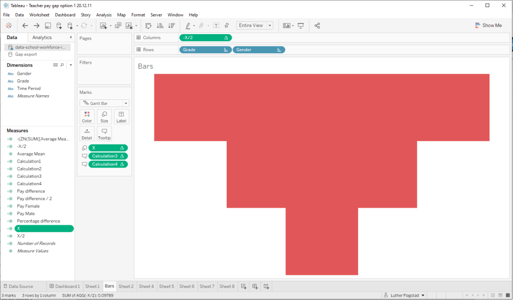

4. Arrange the bar chart sheet on a dashboard so that it’s in the final position. This is an important step–you will want to have the overall idea of your viz pretty much in place within the dashboard so that when you design in figma, your dimensions are accurate.
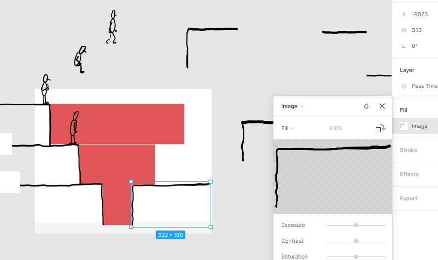
5. Grab a screen shot of the chart and paste it in figma, then rearrange the parts to the chart.
6. Delete the chart, add text or whatever else you want, and save all the parts as a group. Export as a .png.

7. Bring in the image as an image object and arrange around the chart.
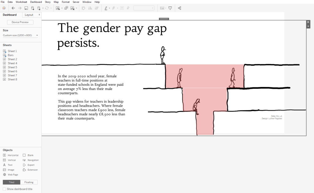
8. As a last step, I changed the opacity to 0%, edited the tooltip, and added source and designed by text. Here’s the final version:

You can view the final version in Tableau Public here.
An alternative
As an alternative to this more patchwork process, you could make the chart first in Tableau and export the image to PowerPoint. There you could draw the image around the chart, and export the final sketch as a picture to put in Tableau.
This option eliminates a couple of the steps. But, it also means you’re stuck with that image once you get in figma. I kind of like having the different parts of the sketch to play around with in figma to make any tweaks before dropping it in Tableau. But, this is another viable way of building a sketch around a chart.
