There are many unique ways to make timelines using Tableau. There’s:
- the classic
- the curvy
- the scrolling
- lollipops
- gantt charts
- vertical timelines
- classic timelines
- half-circle or bubbly timelines
- stacked bars
- and bump charts
There’s all kinds of calendars too:
- as squares
- gantts
- single months
- Planners and other planners
- Using parameters and more parameters
- and with shapes or stacked bars
The timeline calendar
In this post I’ll present a “timeline calendar” as a way to display text along a timeline. This can be done by modifying a calendar view and adding buttons with parameter actions to display corresponding text. (The concept from the parameter actions in this case was developed from Luke Stanke’s post on table pagination. It also includes the steps for auto-deselecting marks that have been clicked, so I won’t include that here.)
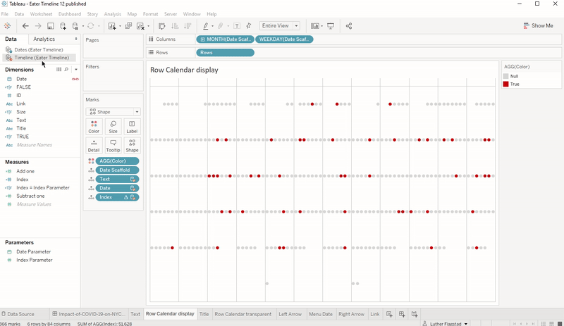
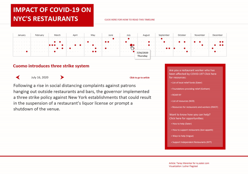
The calendar timeline looks like this:

The calendar displays a dot for each day of the year. The red dots indicate the dates with information to be displayed. You can navigate to each text entry by clicking on the red dots. Or, you can page through the entries by clicking on the arrows above the text. This will jump from red dot to red dot, skipping the dates with no information. The selected date is displayed between the arrows, and the corresponding date on the calendar has a larger red dot.
Making the calendar
The data
We begin with a data set that has a list of dates:
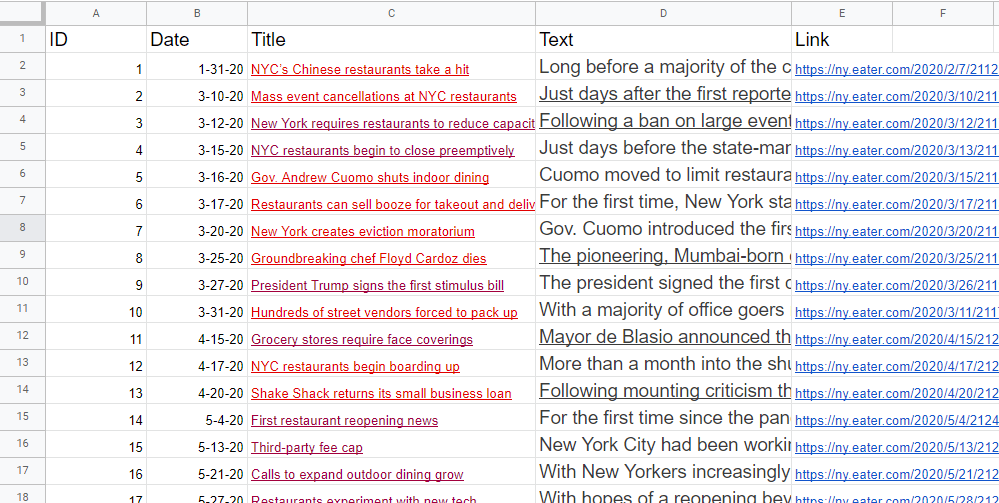
We have a column for ID, date, the title of the text entry, the text itself, and a corresponding link. Note that not every date on the calendar is on this list. There is only data for some of the dates. Since we want a calendar that displays every date (red dots plus the grey dots), we will need to create a secondary data set that includes all the dates to be displayed:
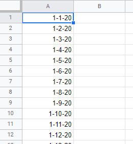
Here we have a single field with all dates in the range to be displayed. (In this case I have every date in the year 2020. But you can include the date range relevant to your data set.)
(Also note that I didn’t include a header for the field. Tableau will interpret obvious fields as needing a header and will assign them “F1,” “F2,” etc., which you can then rename. But if you have a list of categorical members, Tableau may think the first record is the header. So be careful with this.)
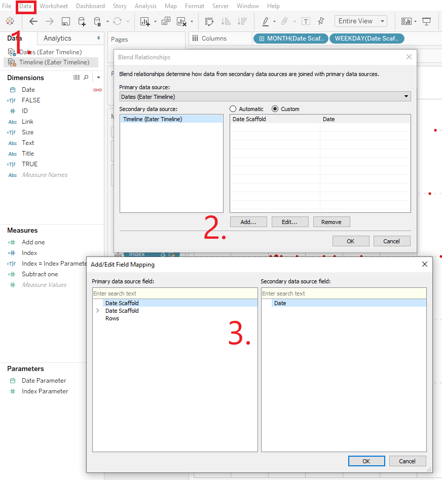
Now you have two data sets which can be blended in Tableau in order to display all the dates. The data sets will be blended on the date fields. The main data set’s date field is called “Date,” and I gave the date field in the secondary data set the name “Date Scaffold.”
After adding both data sets, you will need to set the blend relationship. Click on “Data” then “Edit Blend Relationships…” from the drop-down menu. Next, click on “Add…”, then highlight “Date Scaffold” and “Date”, then click “OK.”
The date fields
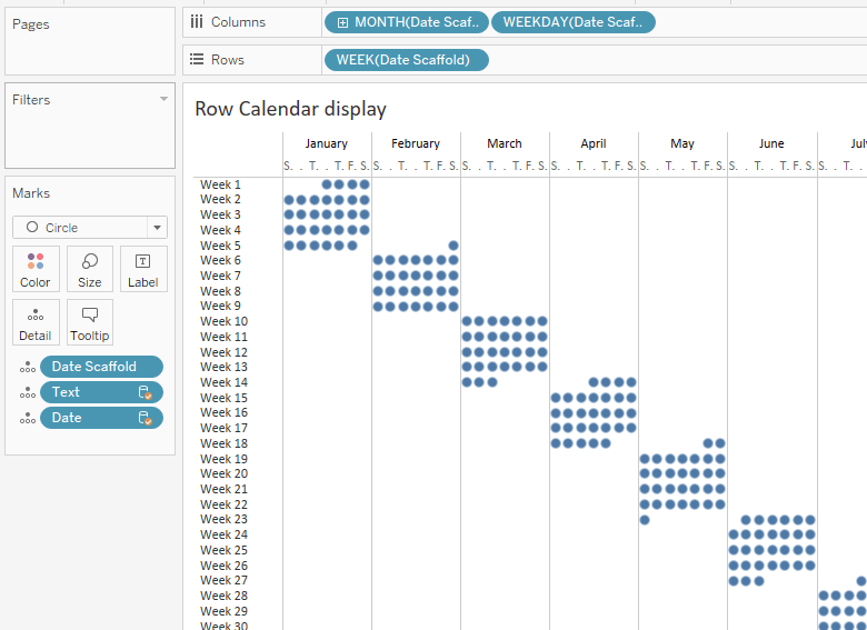
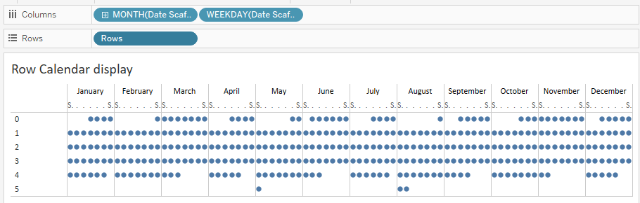
We are now ready to create our calendar view. Right-click and drag Date Scaffold to columns and select date part month (blue). Right-click and drag Date Scaffold again to the right of the first pill on column and select date part weekday (blue).
It’s starting to look like what we want, but the weeks are not properly aligned on rows. Now one would think to pull weeks onto rows, but if you do so, it looks like this:
We need a calculation that will display only Weeks 1 through 6 (the maximum number of rows for a given month). I used the following calculation “Rows.”
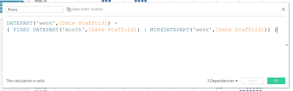
You can think of this calculation in two parts, before and after the “-” operator. The first part takes the week of the year and subtracts the first week that appears in each month. Therefore Week 1 will appear in Rows = 0 because the first week of January is week 1. In the month of February, the last week is Week 10. The first week in February is Week 6. Since 10 – 6 = 4, Week 10 will appear in Rows = 4. And so on, resulting in a readable calendar:
Filling in the calendar
Now we need to add color and size to the calendar.
Color
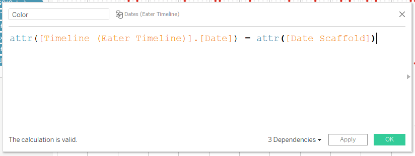
This Color calculation uses the Date field from our first data set and the Date Scaffold field from the second data set. Since we are using fields from two different data sources, make sure that the link next to the Date field in the data pane is selected.
Because we started by using a field from the Date Scaffold data set, this becomes the primary data set. Any fields from the other data set will have orange check marks.
Since we are using two fields from different data sets in one calculation, the fields must be aggregated. I used the attr() function as this aggregates the date fields.
Size
Next we add size:
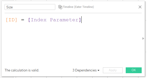
The size calculation uses the ID field and a parameter. The parameter is an integer:
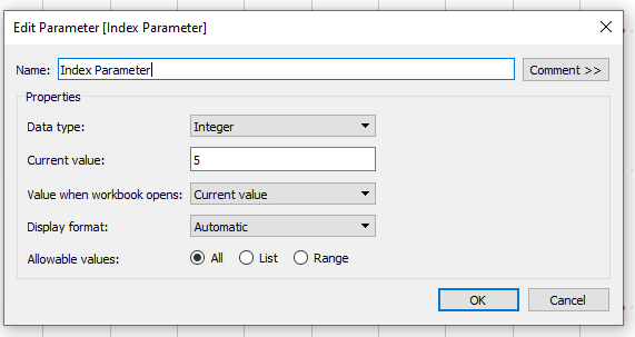
This parameter will play the pivotal part in pulling all of this viz together. It’s a simple parameter which allows for all integer values.
When size gets placed on the size card, it will produce three different sizes for the three different options for ID = Index Parameter. Either true, false, or a null value. There are only some dates for the calendar, so those dates without any information associated with them will be nulls. The Index Parameter can only be one integer at any given time, so we can use this to our advantage to make the selected date the single, largest dot.
We place the size calculation on the size card and adjust the relative sizes:
The index() function
The next piece is to create an index calculation and add it to detail. This is simply index(). If you have not worked with the index function before, I suggest spending some time reading about it. It is a very powerful calculation used in many bespoke data visualizations. Very basically, index() is a table calculation that assigns a value to each mark, starting at 1 and increasing by 1. Table calculations can be adjusted so that the count happens in many customizable orders (across, down, over certain dimensions, etc.). So using the index() here allows us to assign values to certain marks in our view. What we want is to have each of the 49 red dots have the numbers 1-49, in order by calendar date. This way, with a parameter action and buttons, we can move from red dot to red dot, skipping the dates without information.
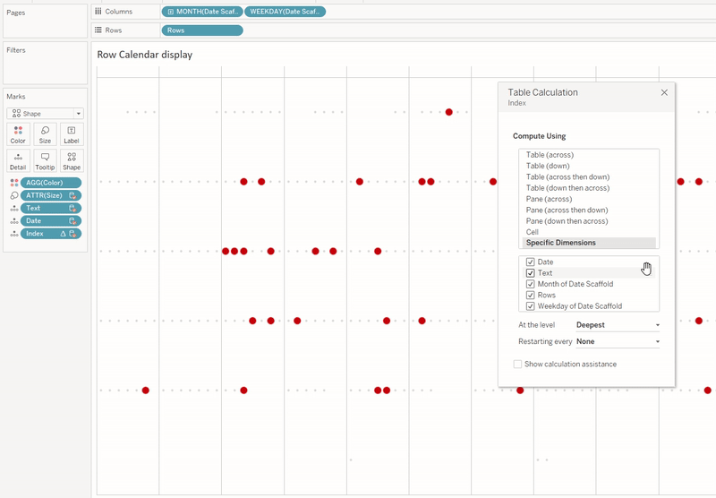
We start by placing index on Detail, then right-click and edit the table calculation. Set compute using to “Specific Dimensions” and select all five dimensions on the list with Date on the top of the list. We next check our Color and Size dimensions to make sure that Color is NOT ignored, but that Size IS ignored in the table calculation. (If we were to include Size, it would give an index of 1 to our large dot, and that’s not what we want.) Now we can scan our red dots and see that they run in order from 1 to 49.
We’re going to take an extra step here, simply for aesthetics. We duplicate the calendar sheet, change the marks to a transparent shape, and float it over the first calendar on our dashboard. This way, the marks on the calendar don’t look like they are selected (ie, we don’t get the black border appearing when a mark is clicked). We will use the sheet with the transparent shape for our dashboard actions, since this is the sheet that the user will be clicking on.
The text field
If we stop there, we’ll have a neat looking calendar, but no story points, so let’s set up the text sheet.
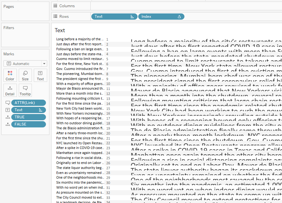
We have Text and Index on rows, and then Text added again to the Text card. We’ll hide the headers on our two dimensions on rows.
In order to filter to a single row, we need a simple calculation:
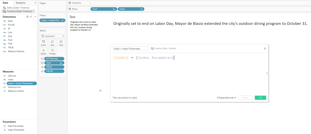
Place this calculation on the filter shelf and select “True.” Now whatever the parameter is set to, that’s the row that the text will display. And we can update the parameter with a parameter action.
Note here that the dashboard also has a text title sheet. This is set up in the same way as the text sheet.
The parameter action
The last piece of controlling the text through the calendar is to create a parameter action. Remember that this is done from the sheet with the transparent marks.
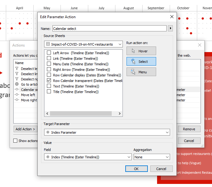
Run action is on select, the target parameter is our Index Parameter, the field is Index, and aggregation is set to None. What this will do is, when a mark is clicked on the calendar sheet, the parameter will update to be whatever the value of Index is for that mark. Since our text sheet has the filter [Index] = [Index Parameter] set to true, when the parameter updates, it will change the row being displayed.
Wrap up
This is everything you need to control the text from the calendar timeline. There are of course the arrows, which I won’t cover in this post as it’s getting pretty long as it is. At any rate, the arrows follow the same concept as my previous post.
The calendar timeline does not need to only refer to text. It could be anything that you set an index to, like marks on a chart. Or, it could be combined with a sheet-swapping parameter to show different sheets entirely.
As always, if you have any thoughts on how this could be combined or ideas for new use cases, let me know!
