
The following are some ideas for creating interesting bar chart effects using jitter plots.
Previously, Toan Hoang of Tableau Magic has written about jitter bars using two dimensions of random() for a nice effect. Below I introduce modifications on creating jitter bars using random() and index() along with playing with sizing and color to customize the bars in unique ways.
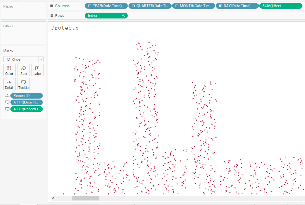
I use here a data set from #MakeoverMonday 2021 week 8, with original data and visualization by Hania Nykowska. Here is my creation using jitter bars with random() and index():
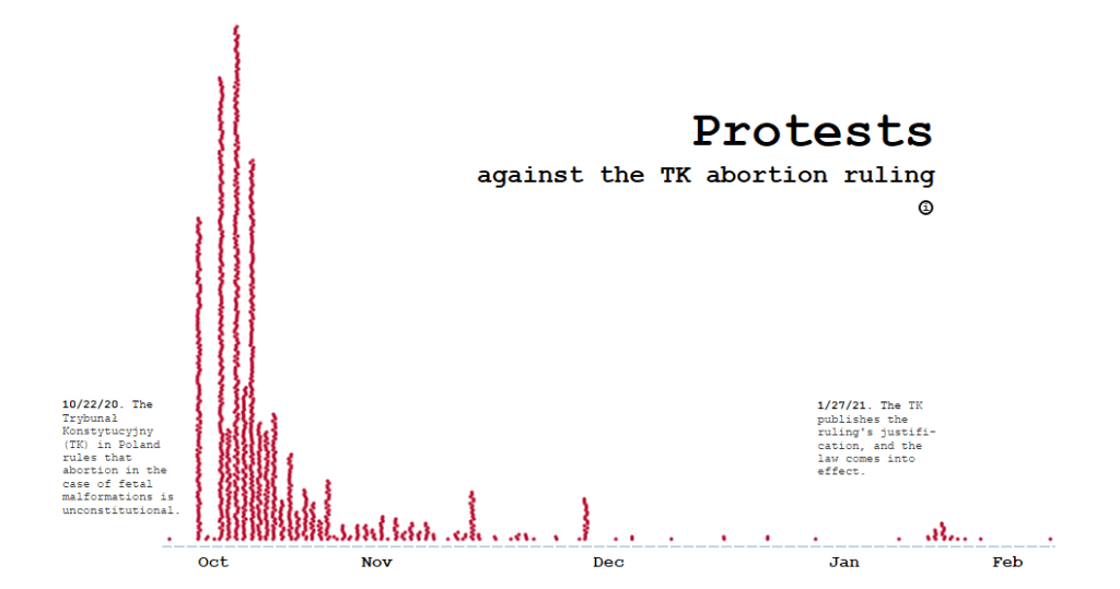
The view of the chart with tall skinny bars gives it an unsettling effect, which I think works well given the topic. Adjusting the bars’ width and the size of the marks creates different effects with this type of chart for the kind of look you’re after. I’ll start with the basics and then show some options for customizing the look.
How to build this style of jitter bar chart
Create two calculations, index() and random().
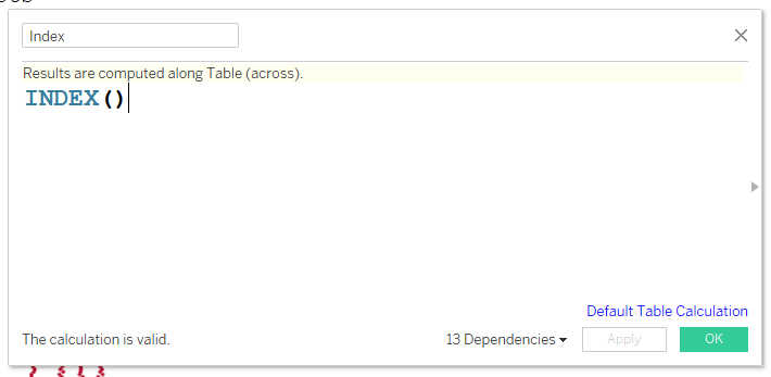
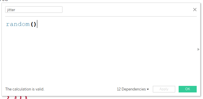
Place your column categories on column, then jitter, which is the random() calculation. Next place Index on rows. Place the dimension that you will be viewing the marks by (in this case Record ID) on Detail. Set the view to Entire View.

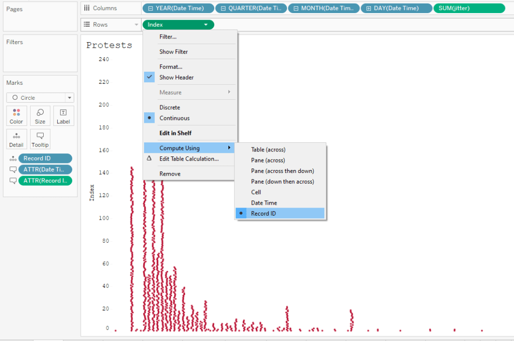
Change the “Compute Using” to be the dimension on Detail.
Next format to remove the column lines, which will create a clean sheet of jittered columns. Lastly, hide the headers.
Customizing
You can now play around with the width of the chart and the size of the marks to get differing effects. For example, in the chart above, I have the scope on Entire View. But if I fit to height, the chart looks like this:
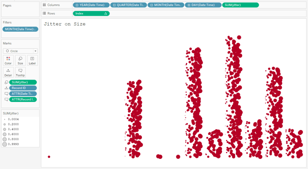
Jitter on Size
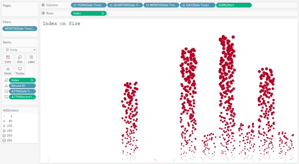
Index on Size
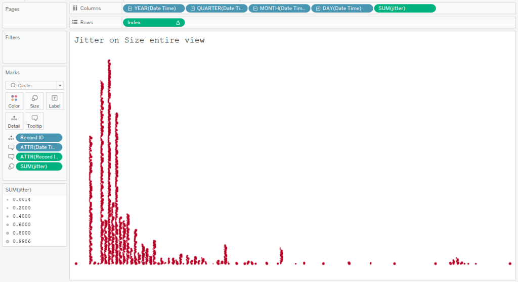
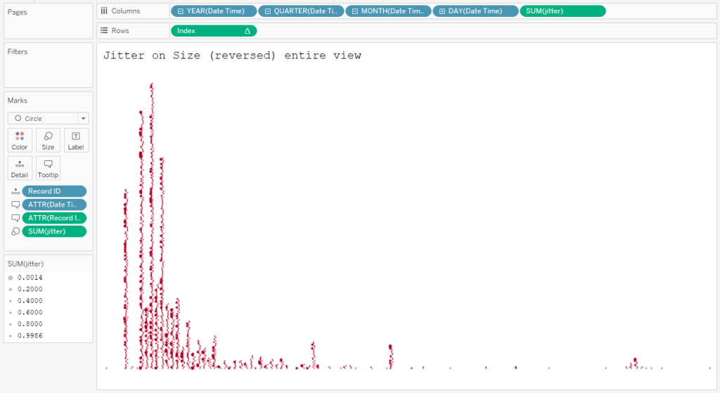
Jitter on Size (entire view)
Jitter on Size reversed (entire view)
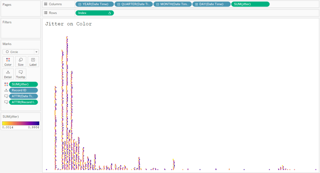
Jitter on color
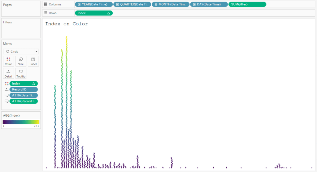
Index on color
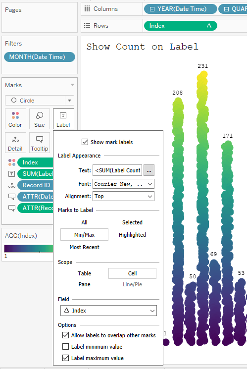
Show count on label
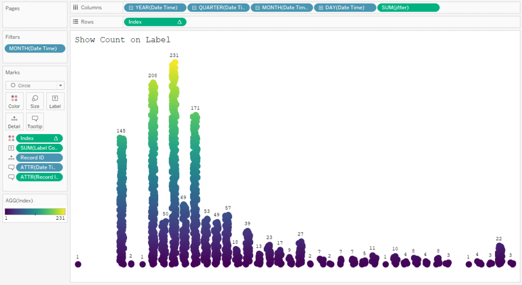
To get the labels to show up at the top of the bars, first create a calculation fixed to the column dimension:
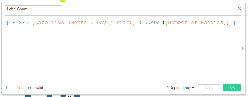
Then place this calculation on Label and make the following selections: Alignment > Top, Marks to Label > Min/Max, Scope > Cell, Field > Index, Options > Label maximum value.
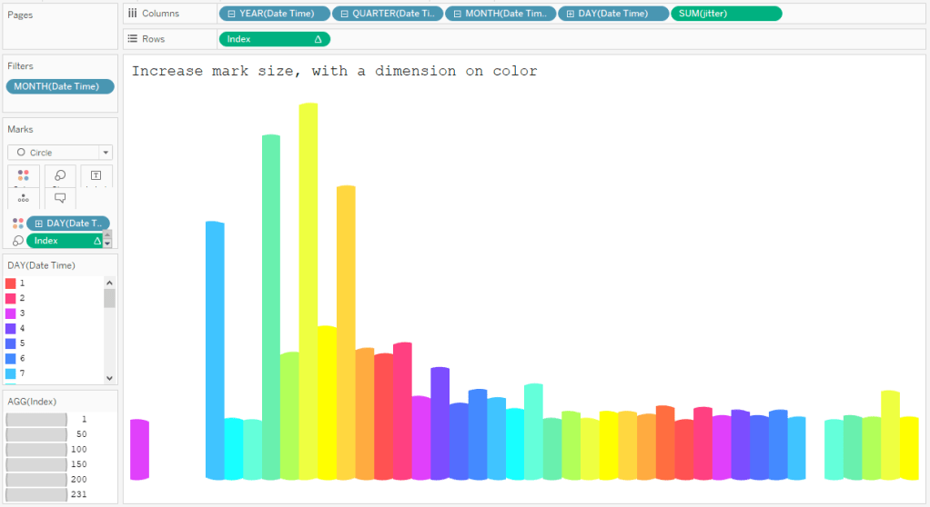
Increase mark size, with a dimension on color
This last one is simply for fun, as the length of the bars will not represent well the number of marks within the column. I suggest reserving this chart as a design element.
There you have it! Themes on the jitter bar chart.
