
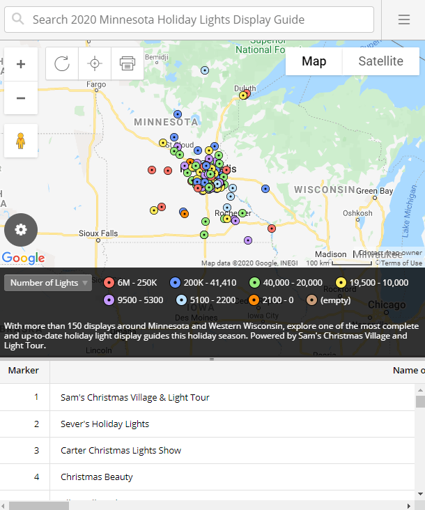
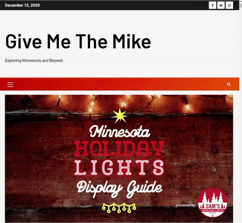
A couple weeks ago when looking for data on holiday light displays, I came across a website that showed a list of different houses and locations in Minnesota that were displaying lights this holiday season. The website had a little map made with batchgeo, showing the locations of displays as well as a table view:
The website is really neat, and hugely popular in Minnesota right now. With more people staying home, there seems to be more excitement around light displays. Yet for the website, the design of the map seemed out of place given its theme. I reached out to the website’s owner to propose a new map.
I set a few objectives/constraints for the map:
- The marks on the map would look like little shining lights.
- All sheets would need to be tiled. (It would be accessed from many different devices, especially mobile phones, and so would need to be optimized to any potential screen size.)
- Users would need the option to see the sites on a map and in a list view.
- The design should seamlessly accommodate the user’s goal. (Which was to find places to see lights.)
With this list in mind, I put together a map for the site.
Here is how it displays when the website is accessed from a desktop:
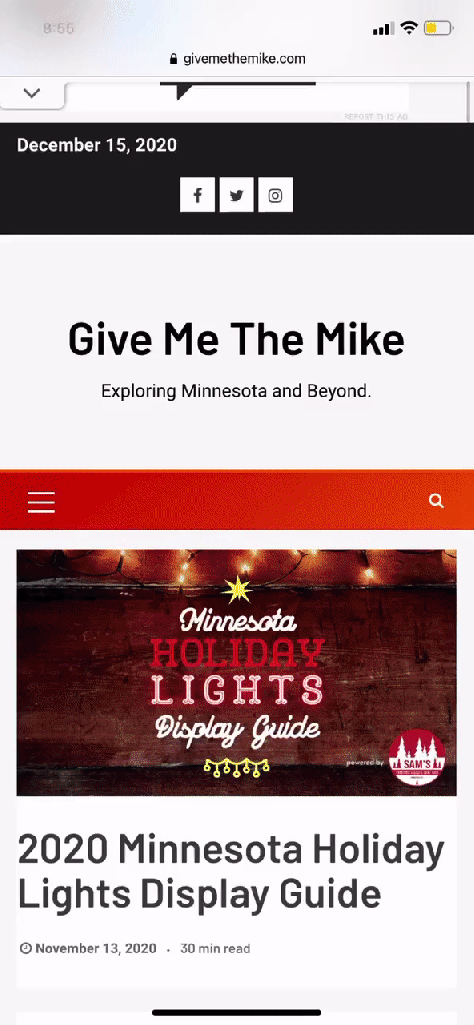
And here’s what it looks like from a mobile phone (iPhone XR):
There was a reason why the site initially had a generic google map. People just needed to know where to see the lights. But with a different design, I felt the map could be something more.
I’m not going to say this map has the most amazing design a map could possibly have–but–it doesn’t get in the way. The map allows the user to find what they are looking for. I like to believe that it also looks cool. And I think other people do too.
It’s often said that good design makes you believe it’s not there. You don’t think about it consciously.
Don Norman talks about the three emotional levels of design: visceral, behavioral, and reflective. I think the reason this map works is because it works on all three levels. Visceral: It’s fun. It looks attractive. Behavioral: This is where “stuff gets done.” You don’t have to think about using it–you “feel in control.” And reflective: It’s that little voice that passes judgement where you feel that it’s good.
Despite this ease of emotion, the visualization wasn’t easy to make. It took time to think about how to position the various elements, the color, the font, and especially the optimization for different screen sizes. It had to work regardless of whether a person was on their computer or scrolling through an iPhone XS–or the 12 mini.
So, if you live in Minnesota and want to see light displays, check out Mike’s website. Or if you just want to interact with the map, you can see it here too.

